
Client Overview
Studio Mint.co is a vibrant and creative agency specializing in crafting bold and innovative brand identities. The team, comprised of young professionals, focuses on delivering unique, dynamic solutions that captivate and engage audiences. Their tagline, “Designs that Pop, Mint Non-Stop,” highlights their passion for fresh, modern designs that stand out in the crowded design landscape.
Project Objective
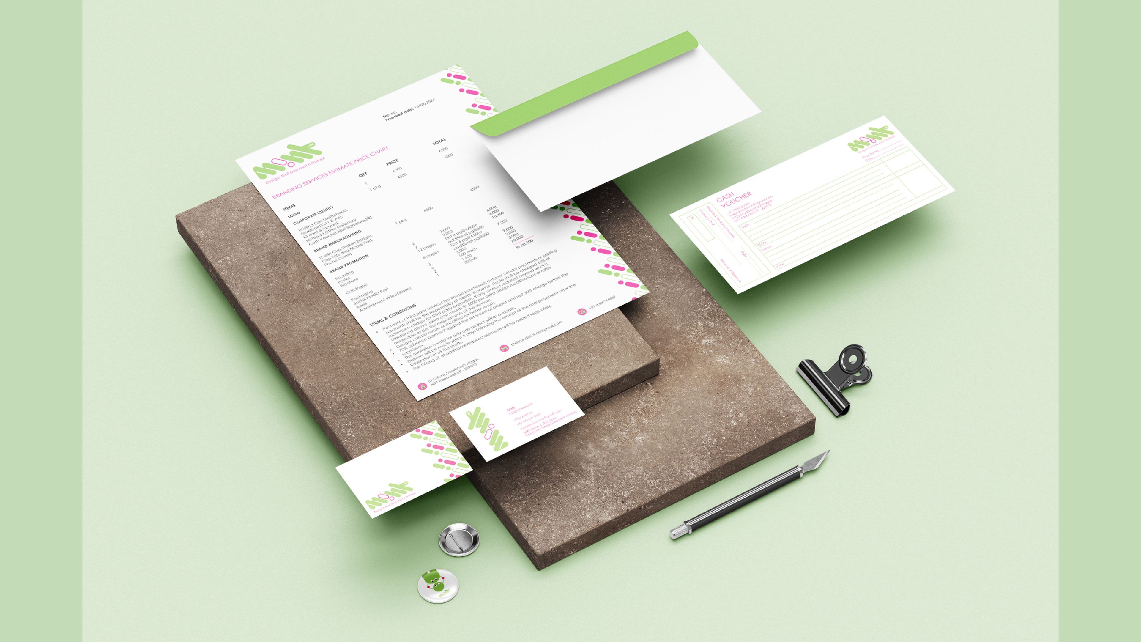
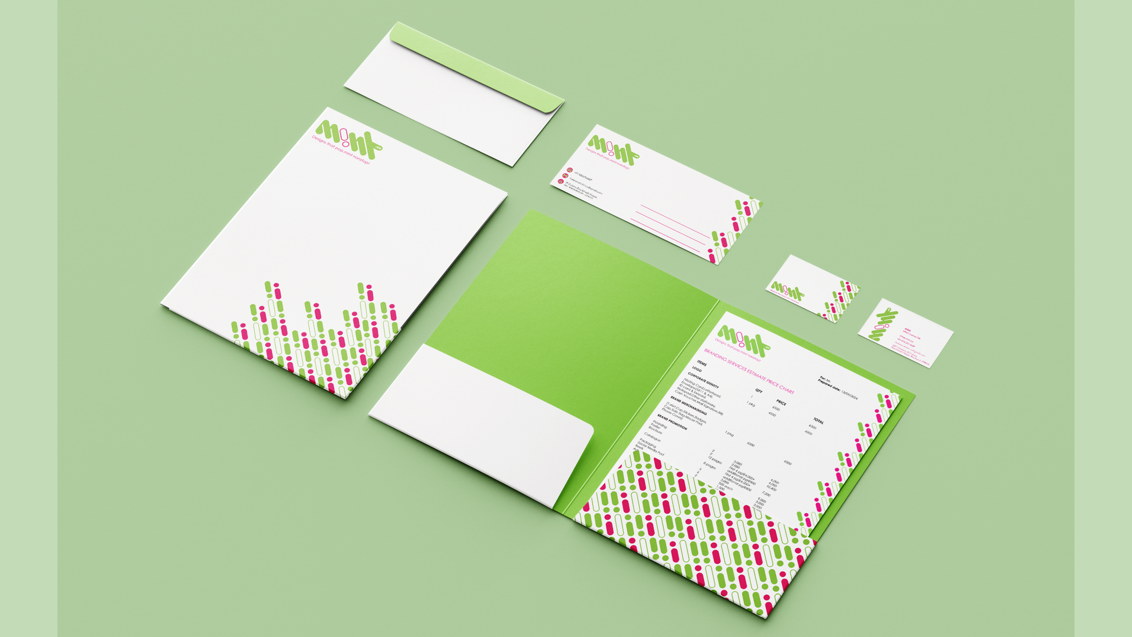
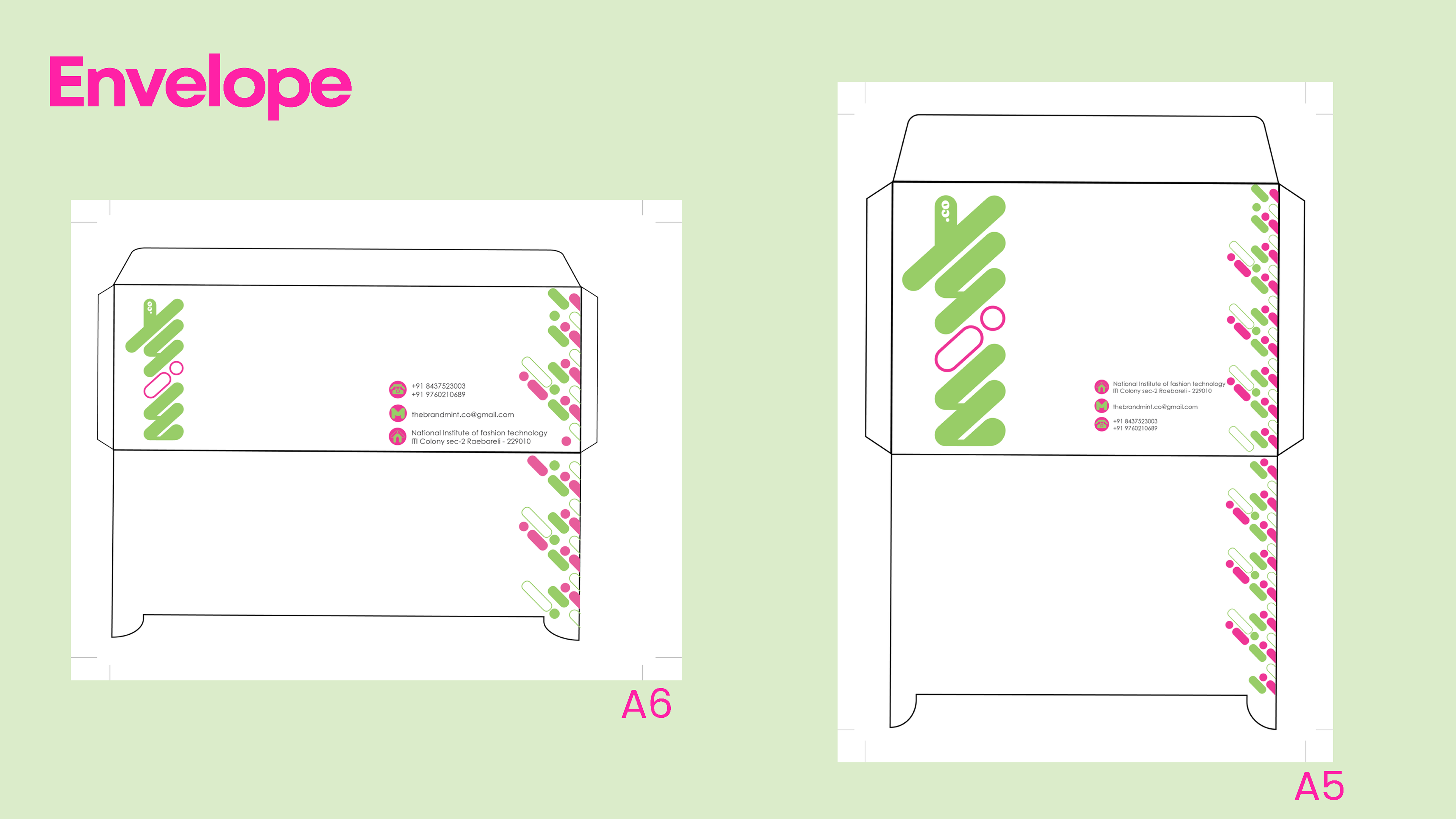
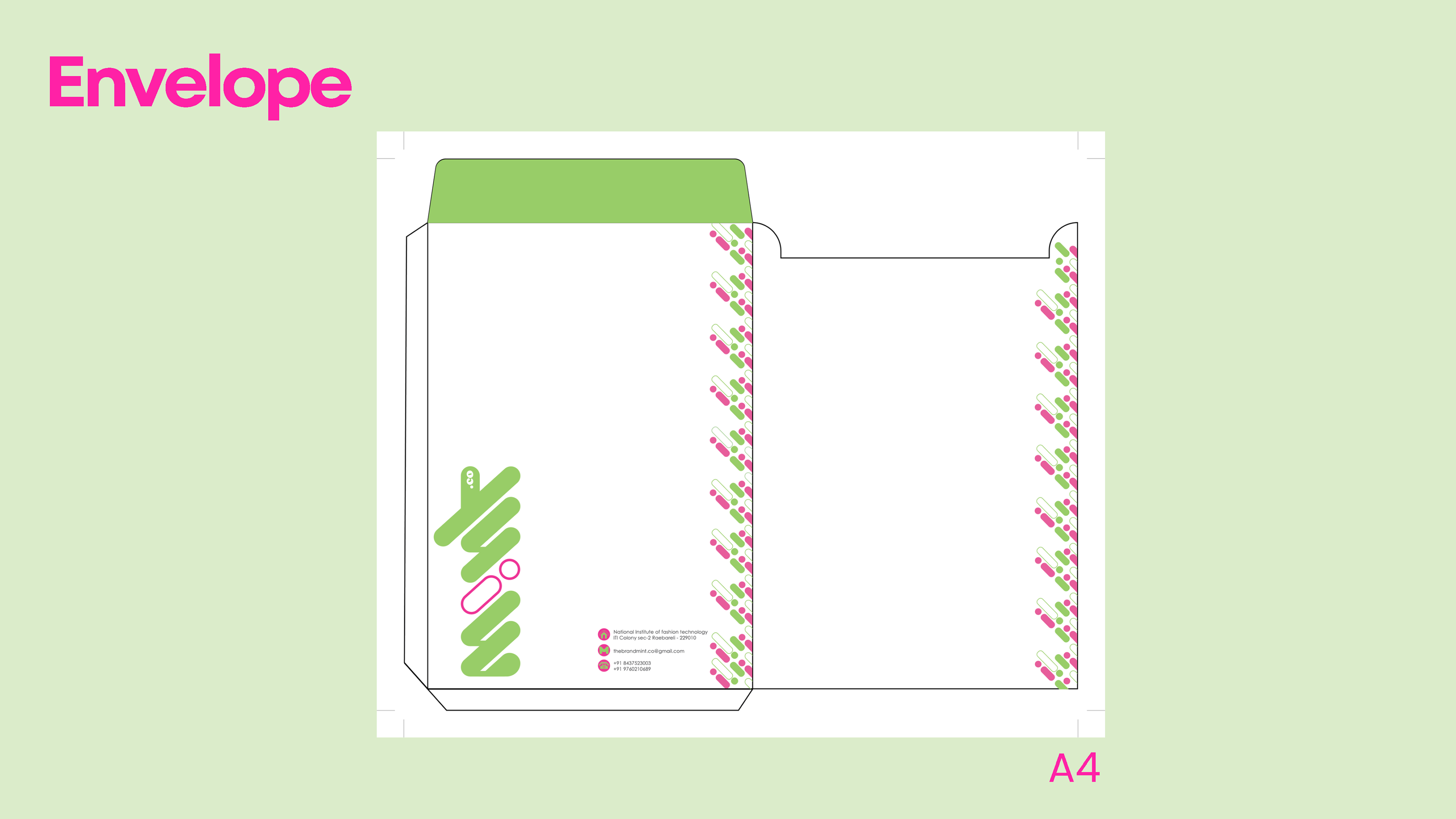
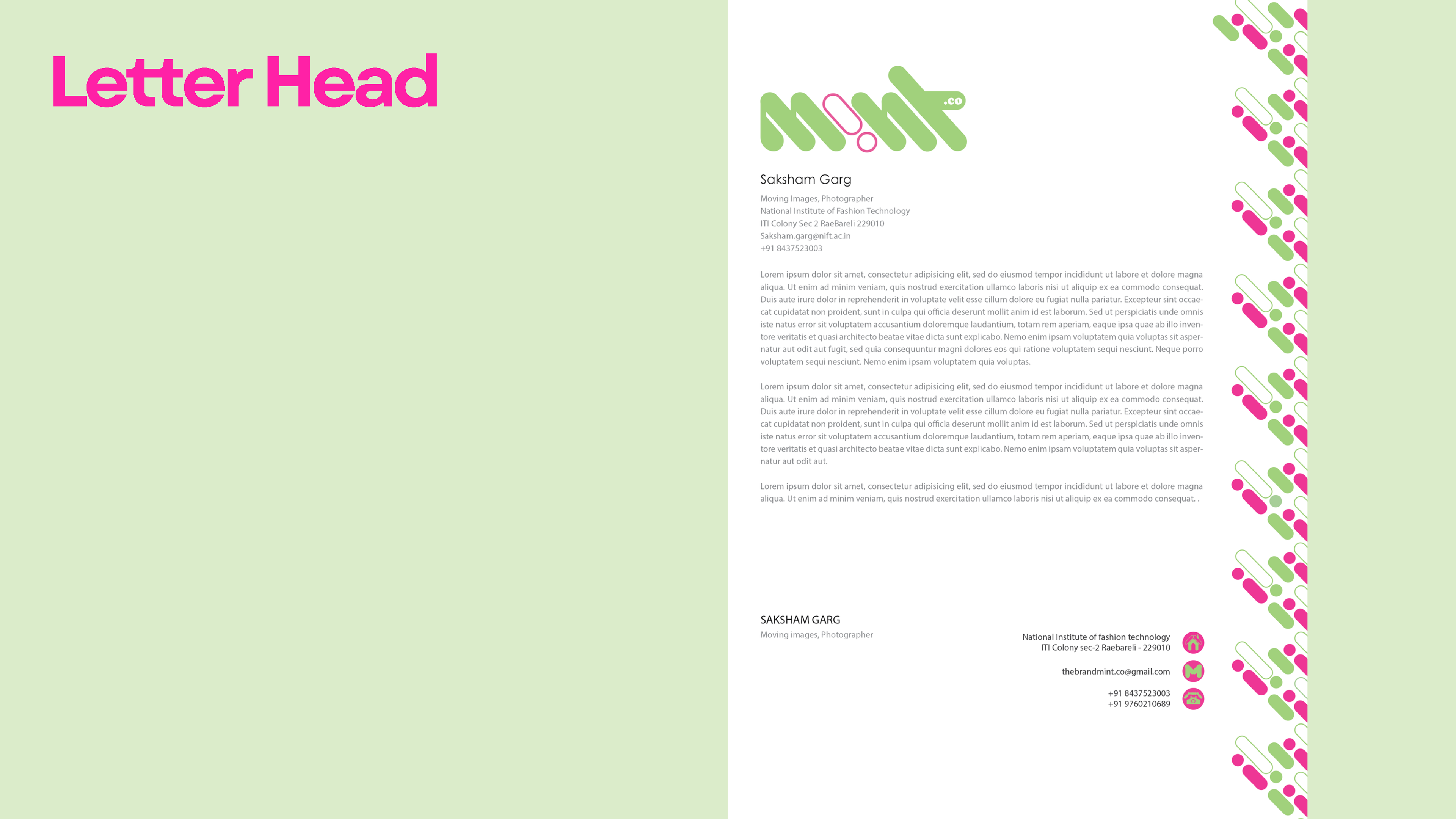
The objective of this project was to create a comprehensive brand identity that reflects Studio Mint.co’s energetic and innovative approach to branding. The identity needed to communicate professionalism, creativity, and modernity while standing out in a competitive market. The deliverables were designed to ensure consistency across various media, from digital platforms to physical materials.
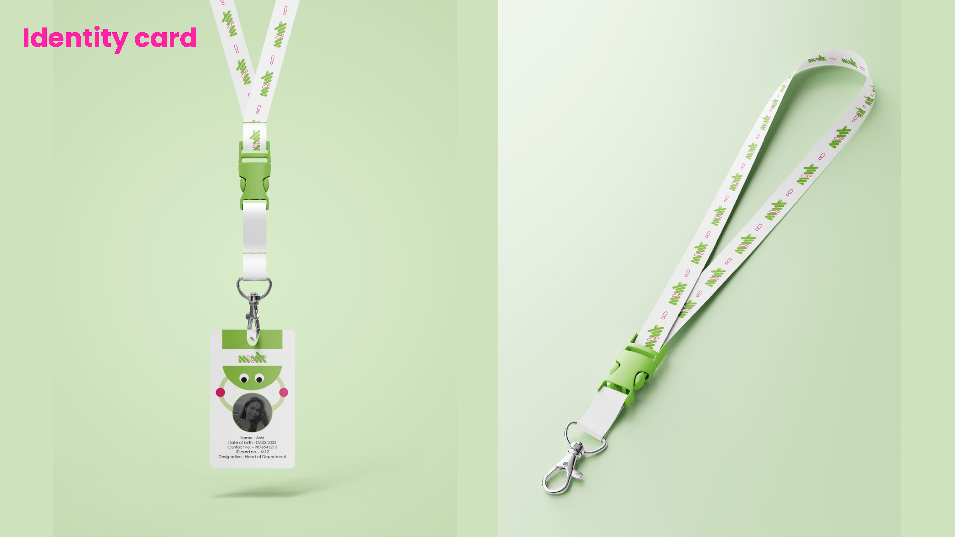
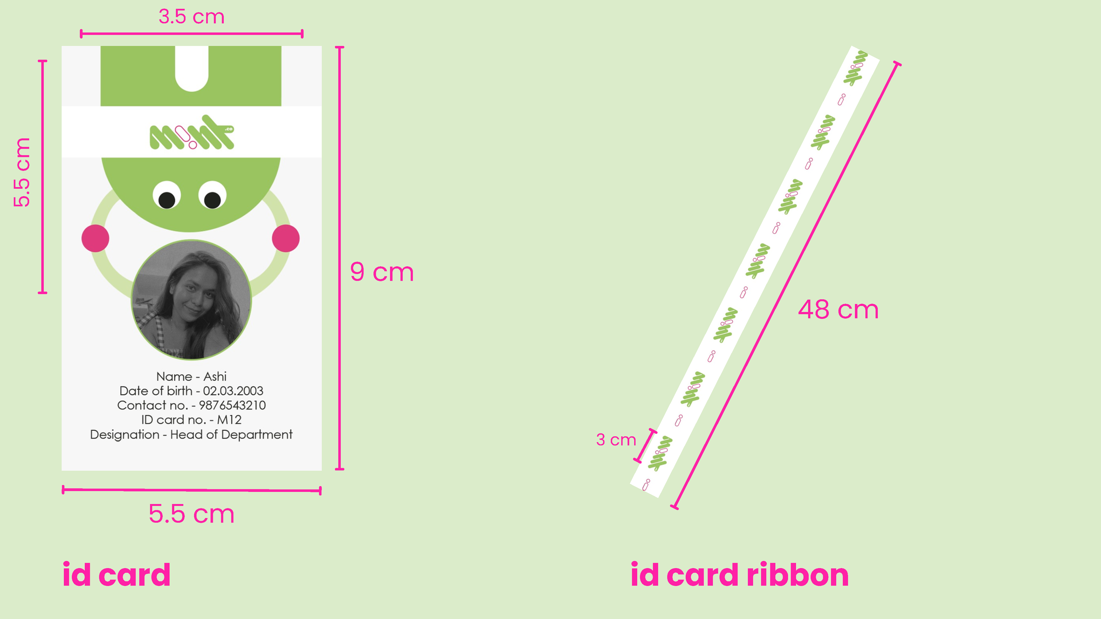
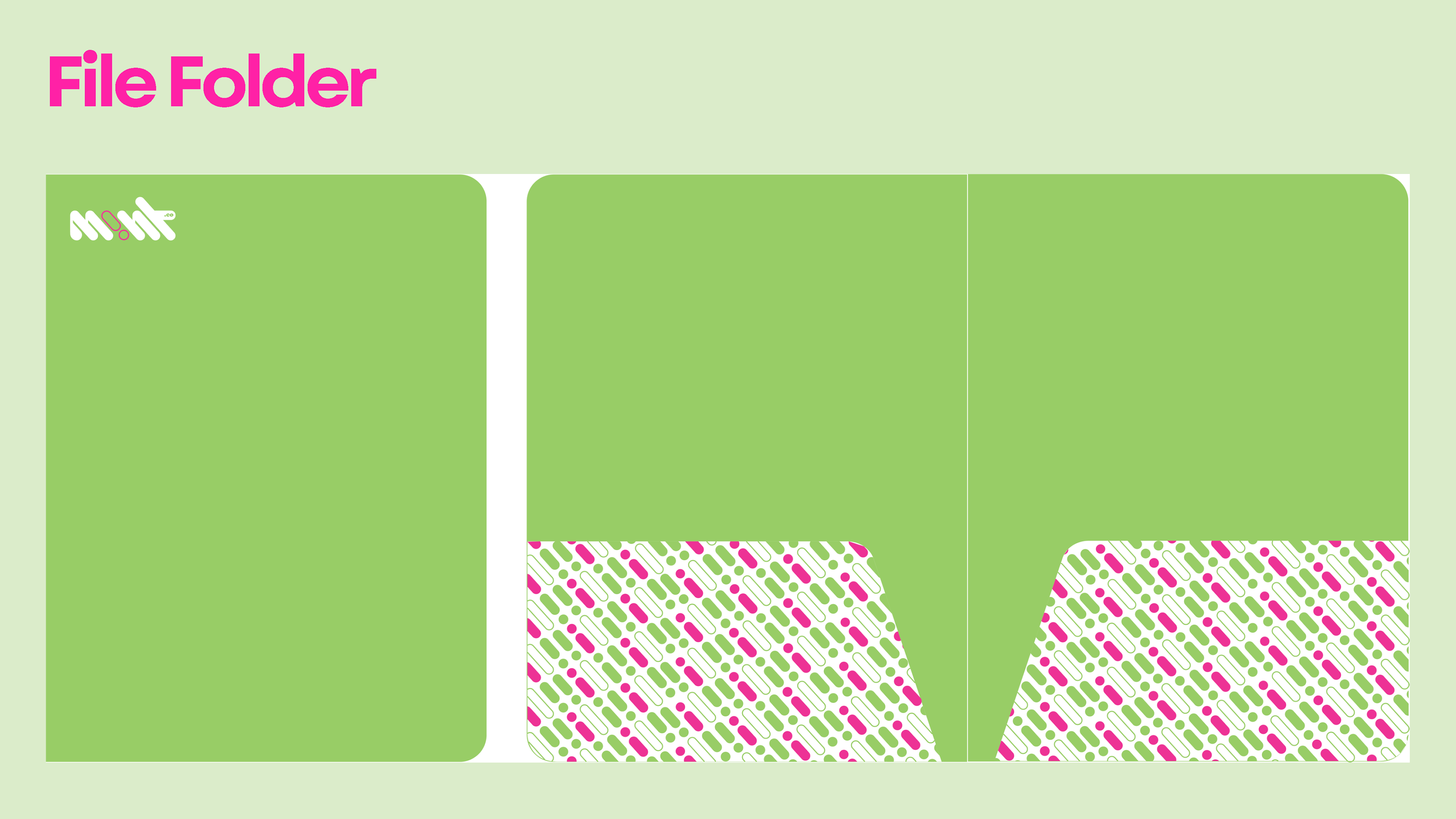
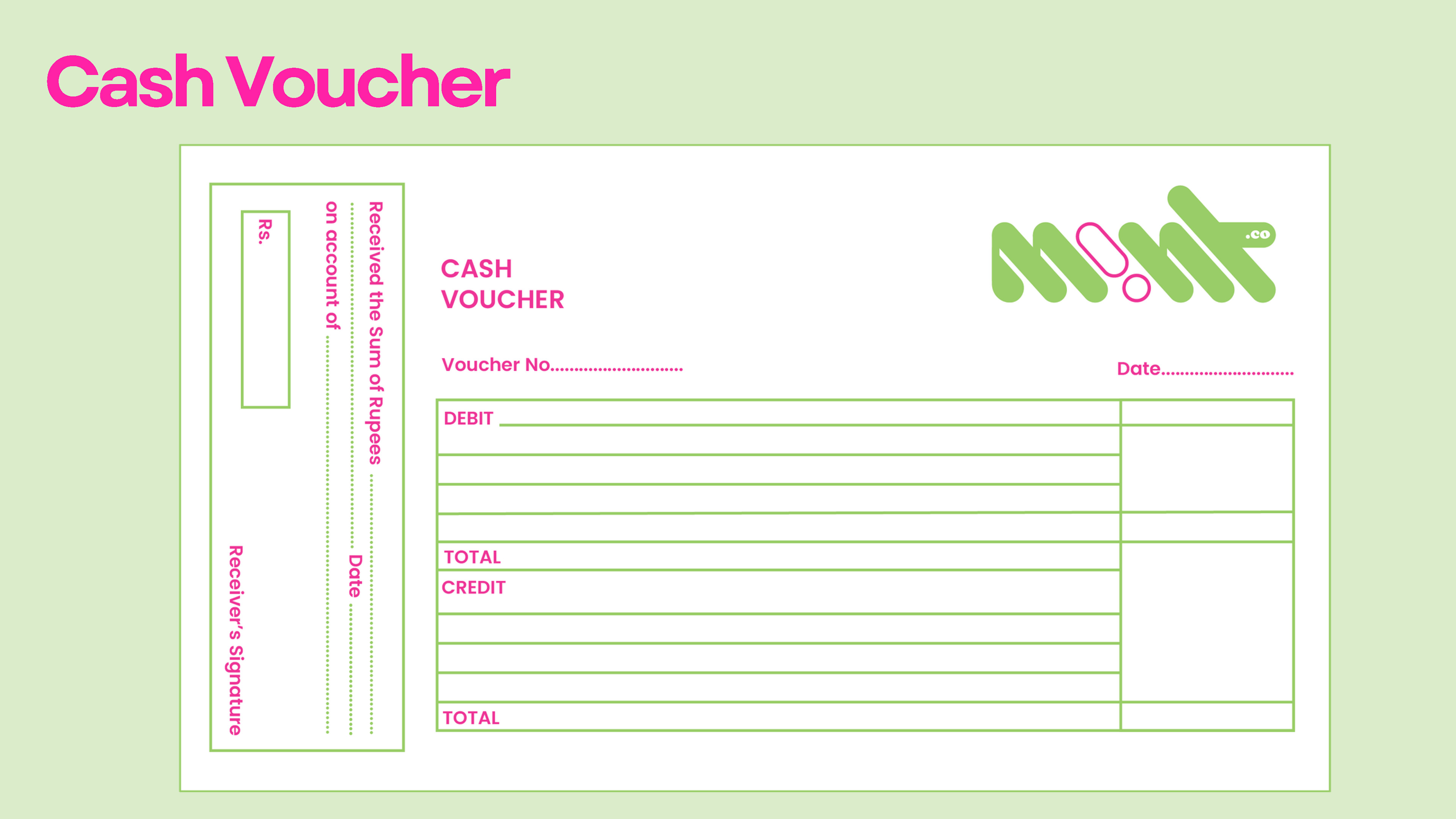
I was tasked with developing both corporate identity materials and branded merchandise
for Studio Mint.co.
Design Concept & Process
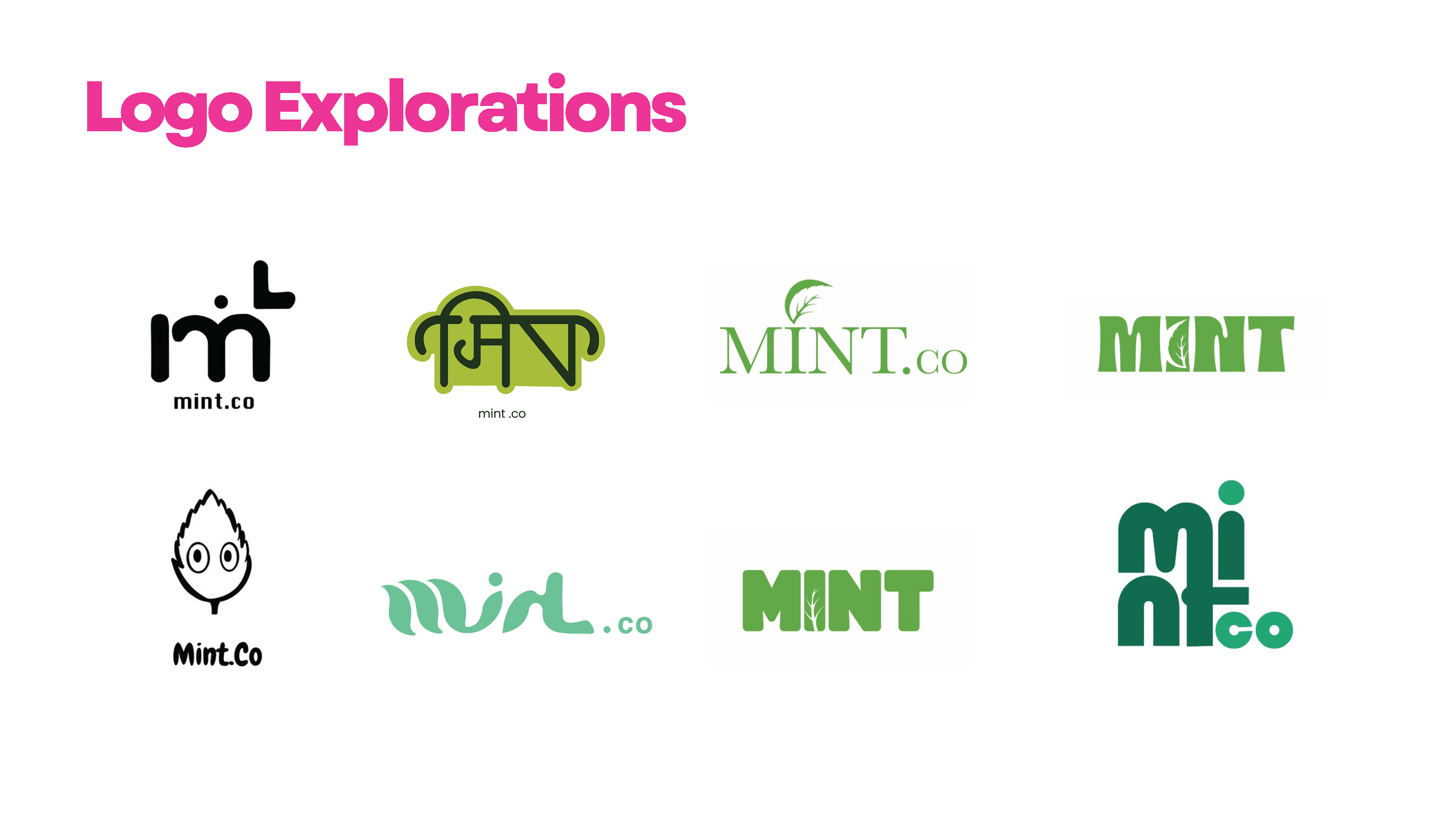
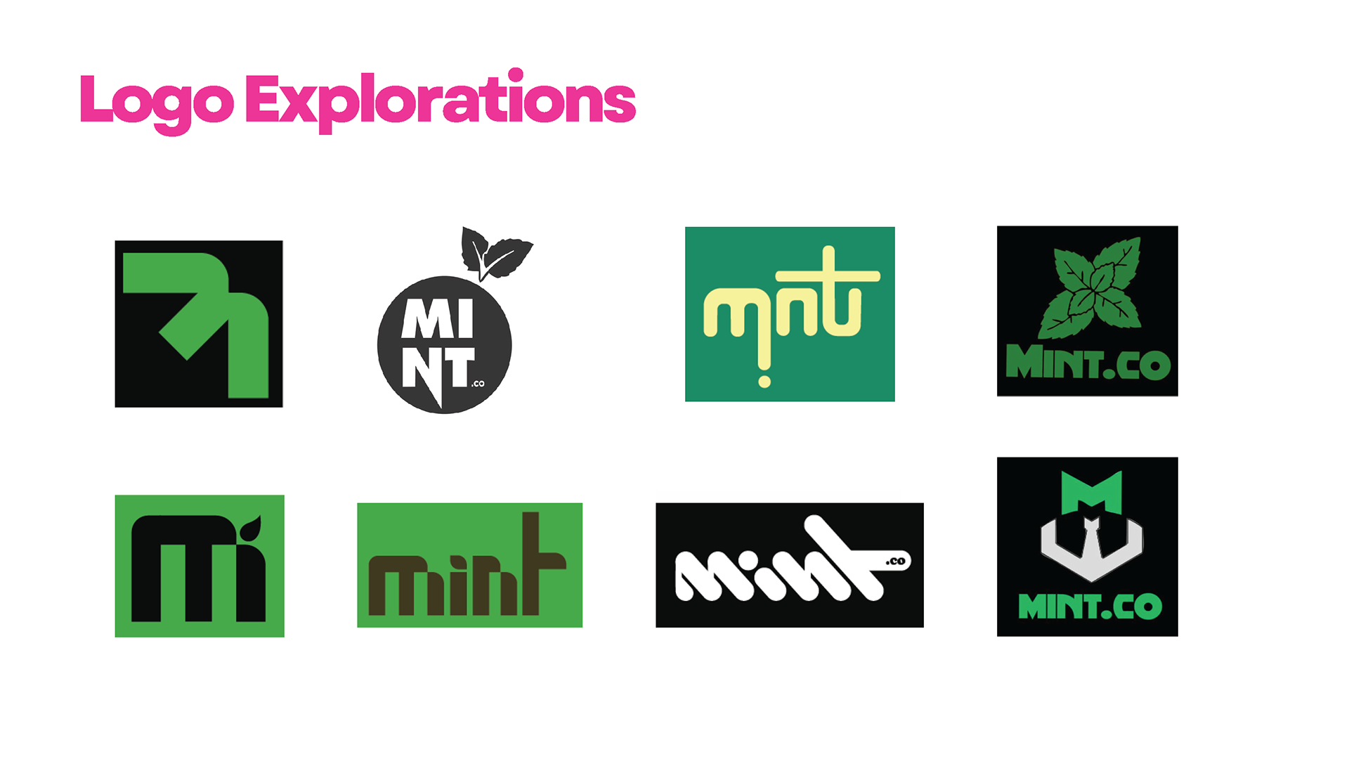
Research & Inspiration
Understanding Studio Mint.co’s target market and values was key to creating a design language that resonated with their audience. Trends were explored in modern design while ensuring the brand identity would be timeless and adaptable.
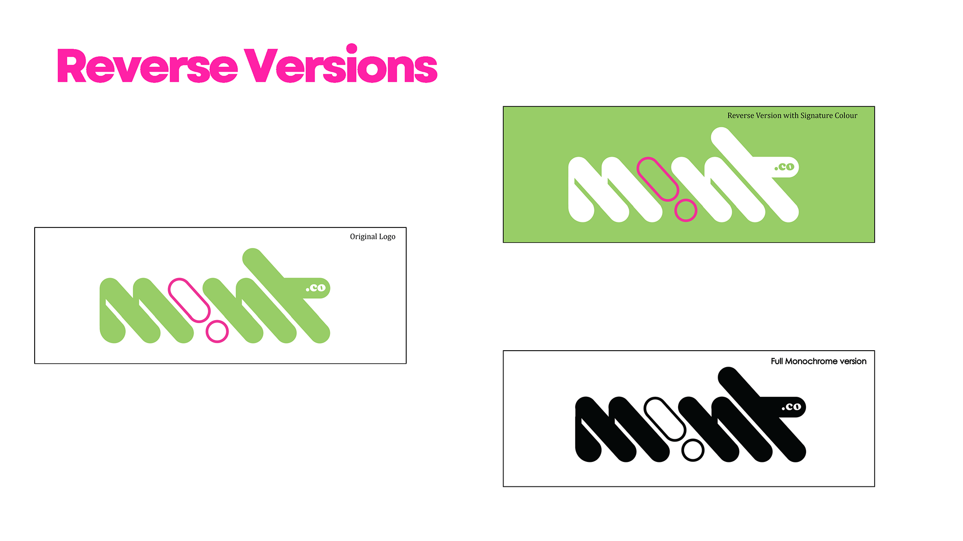
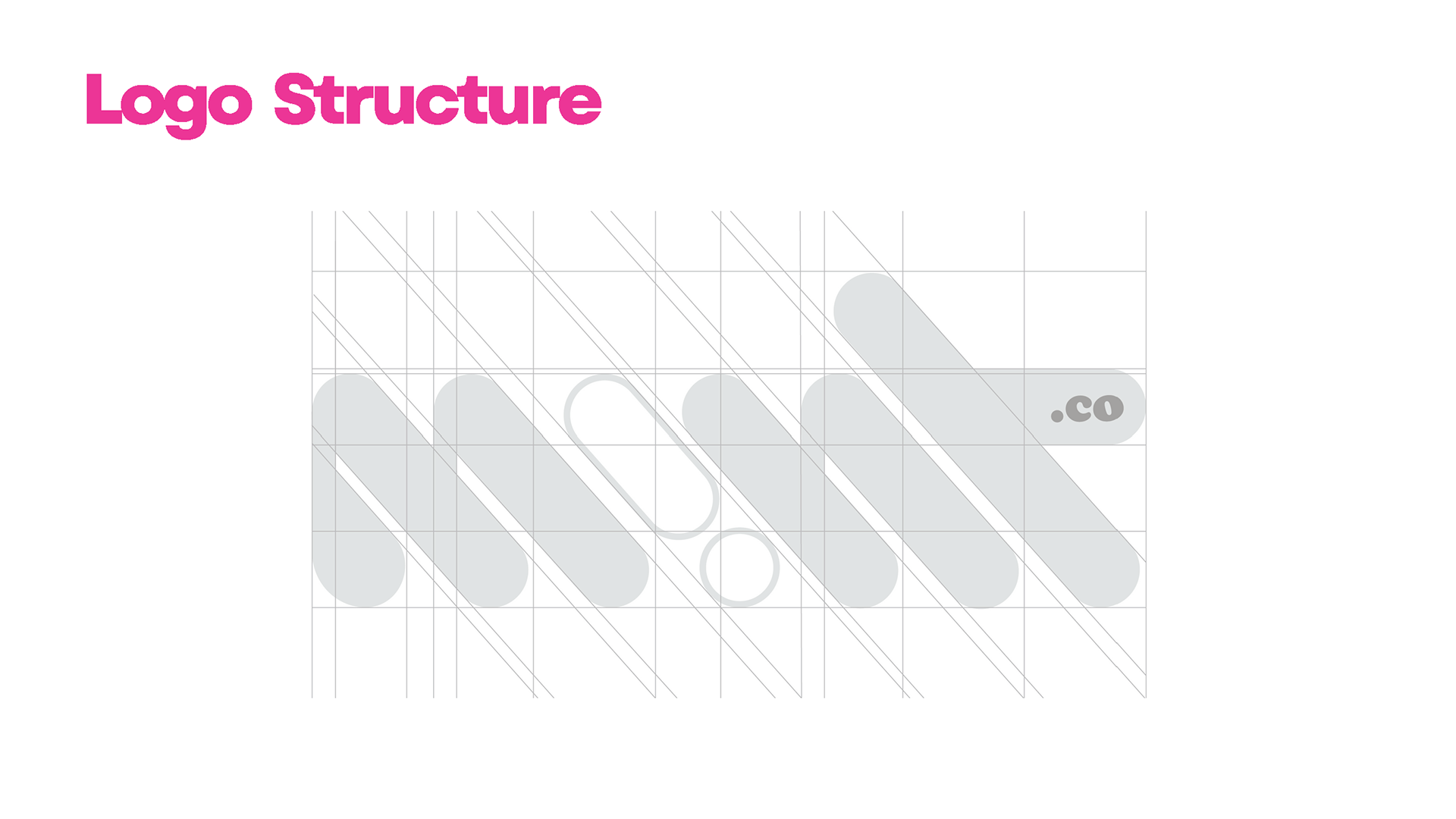
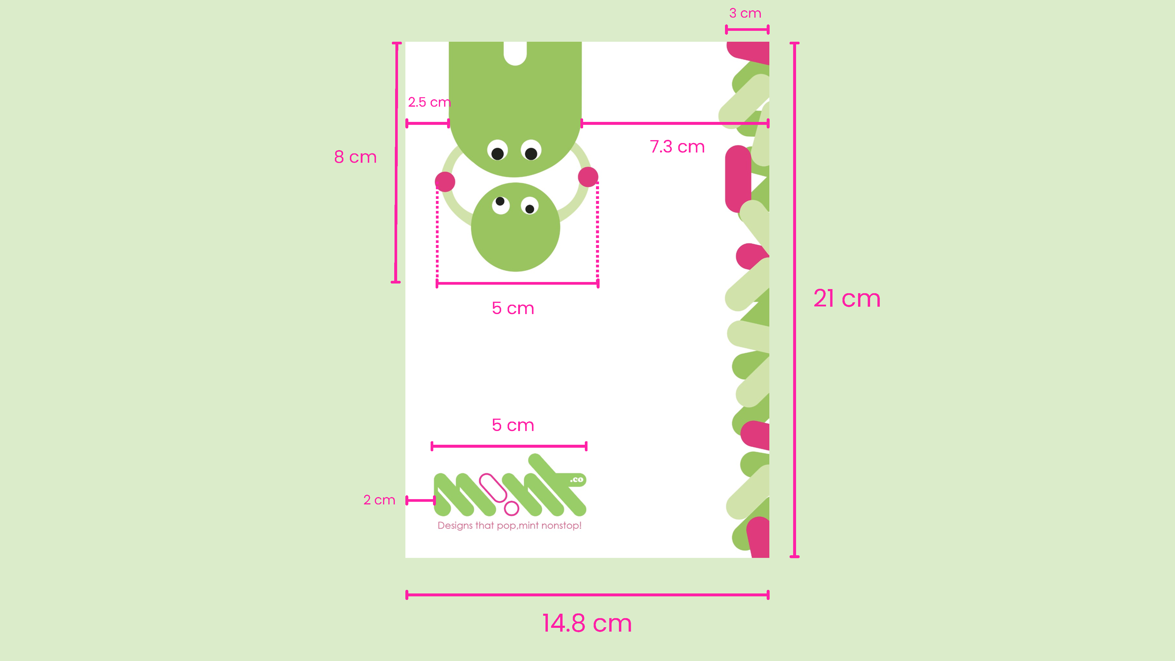
Logo Development – The typography-based logo was crafted to be distinctive, clean, and adaptable to both digital and print formats.
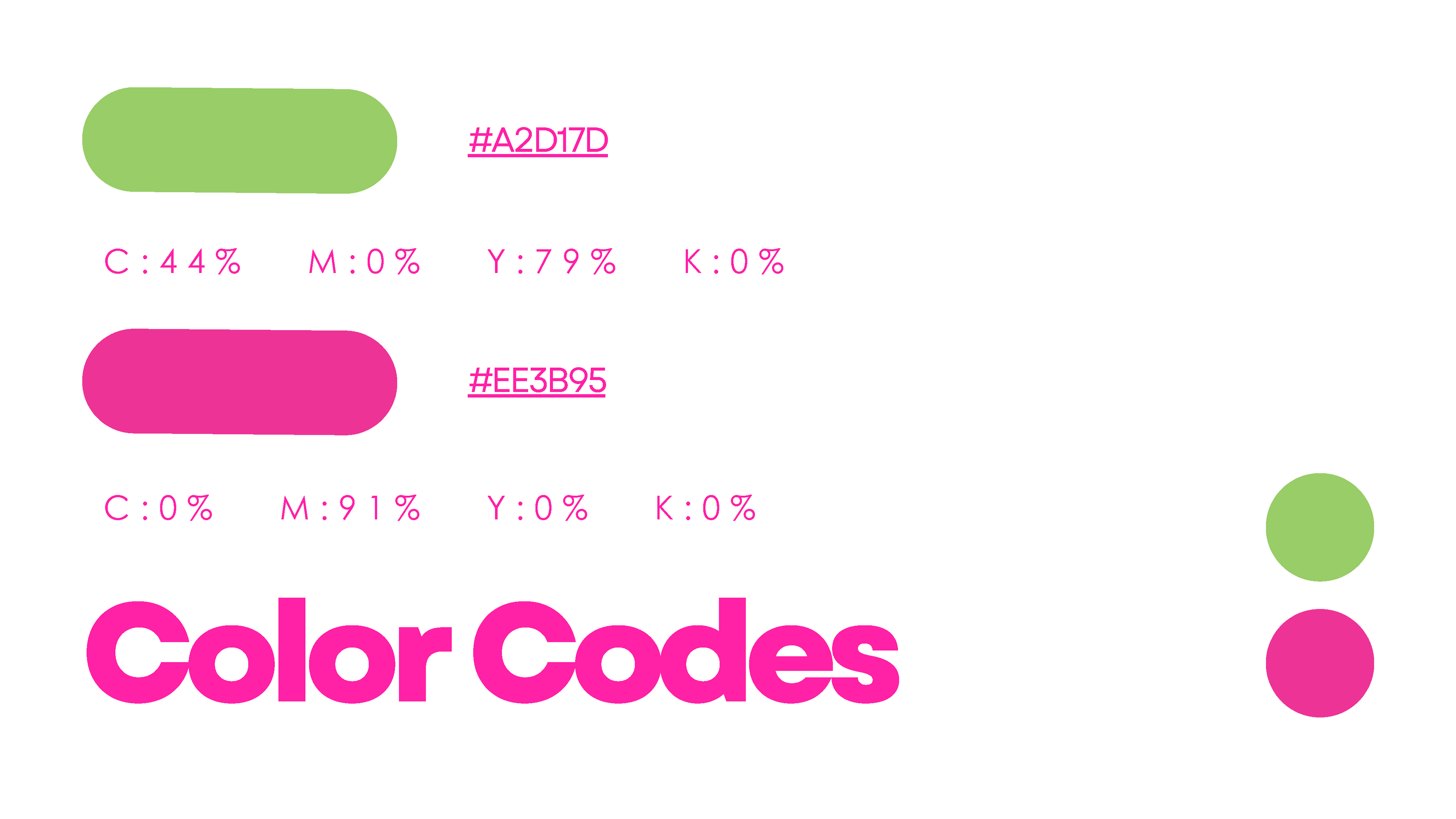
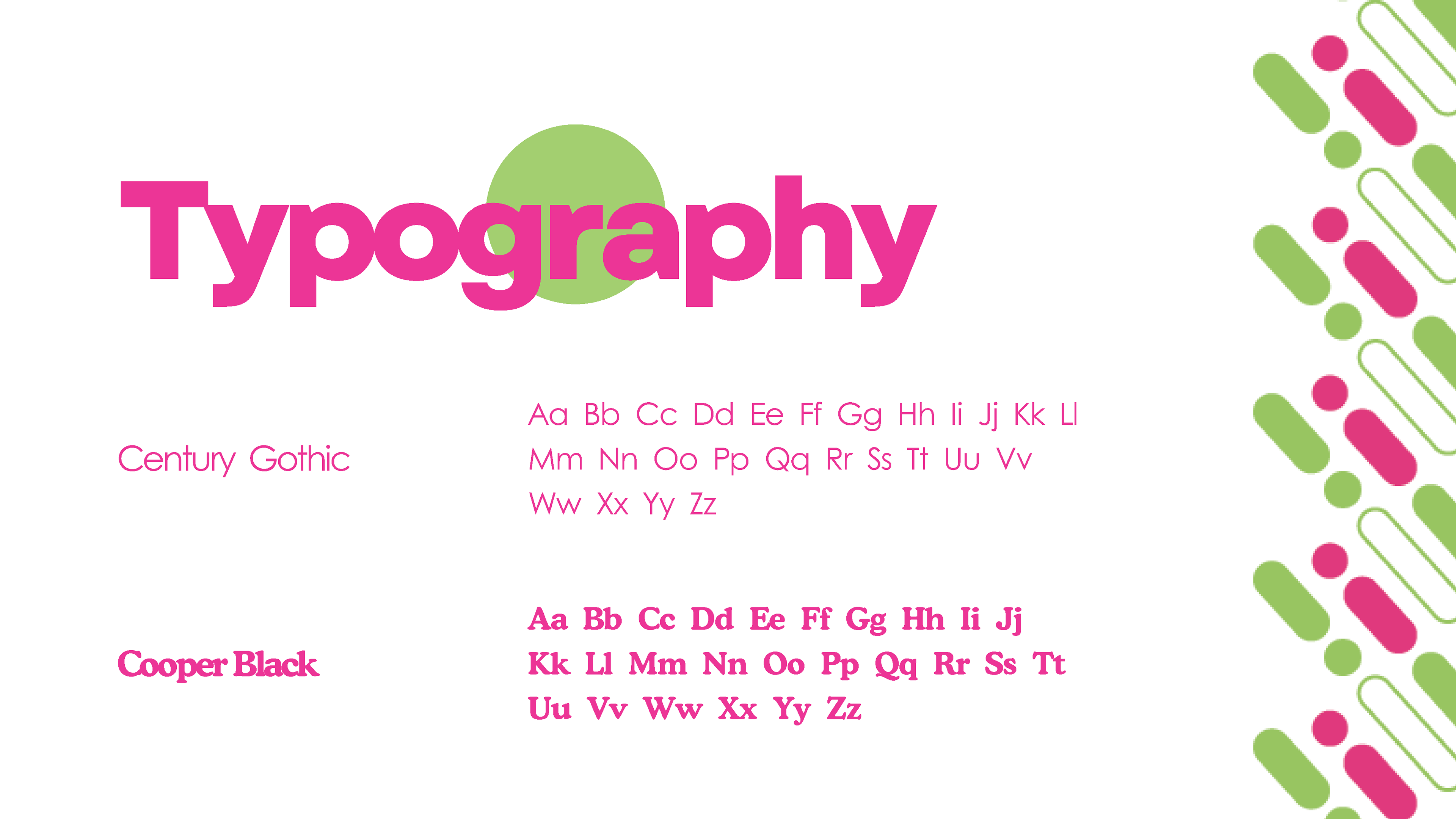
Color Palette & Typography
Bold colors and contemporary fonts were selected to reinforce the youthful, energetic vibe of Mint.co, while maintaining a professional look.
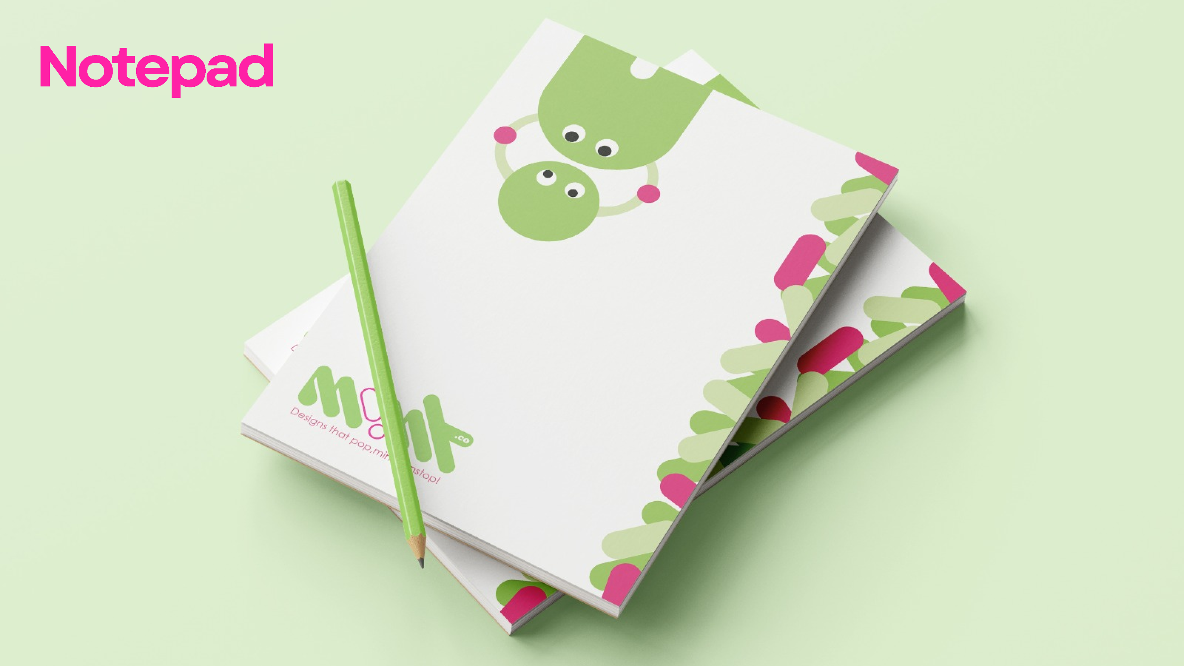
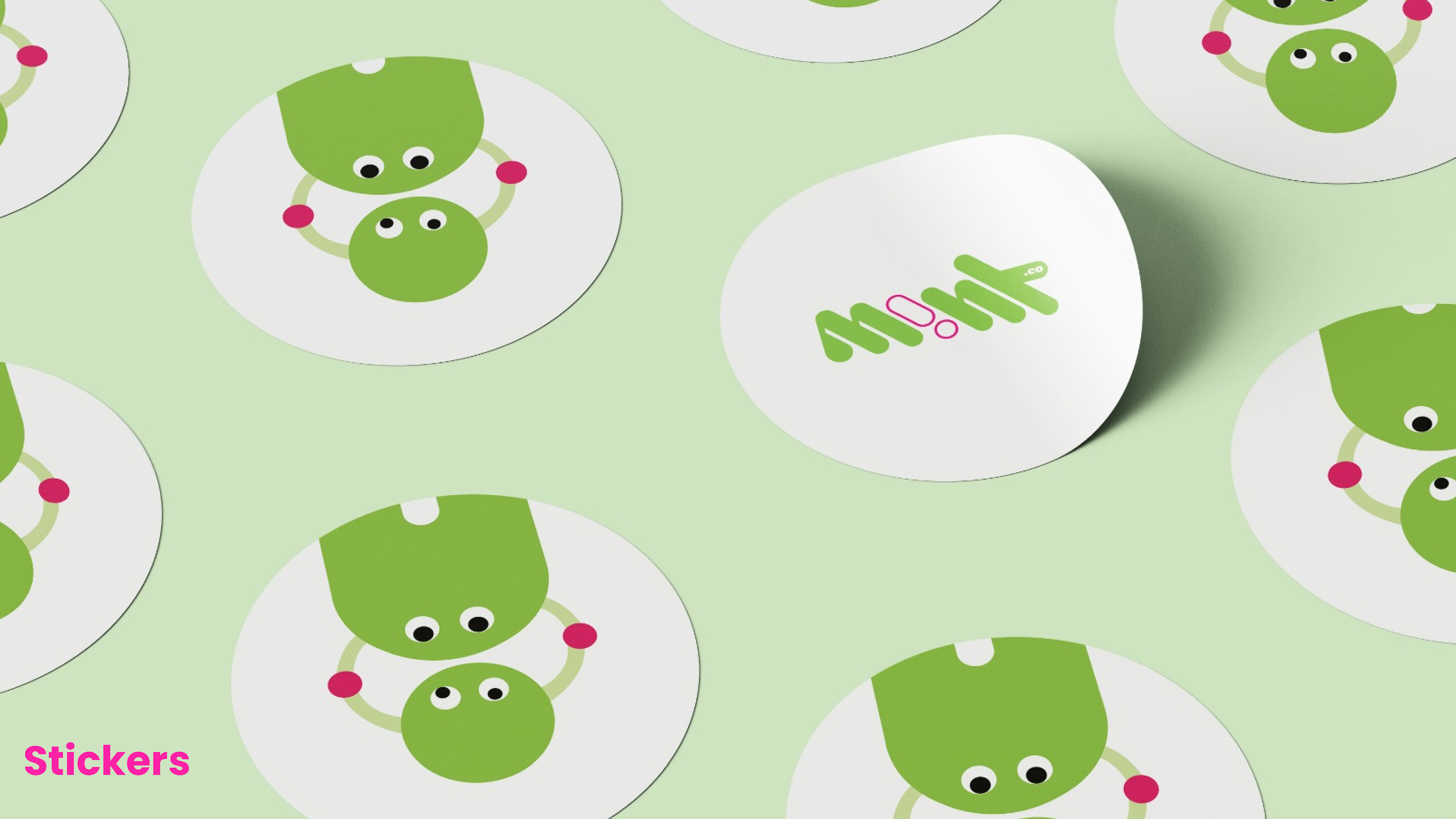
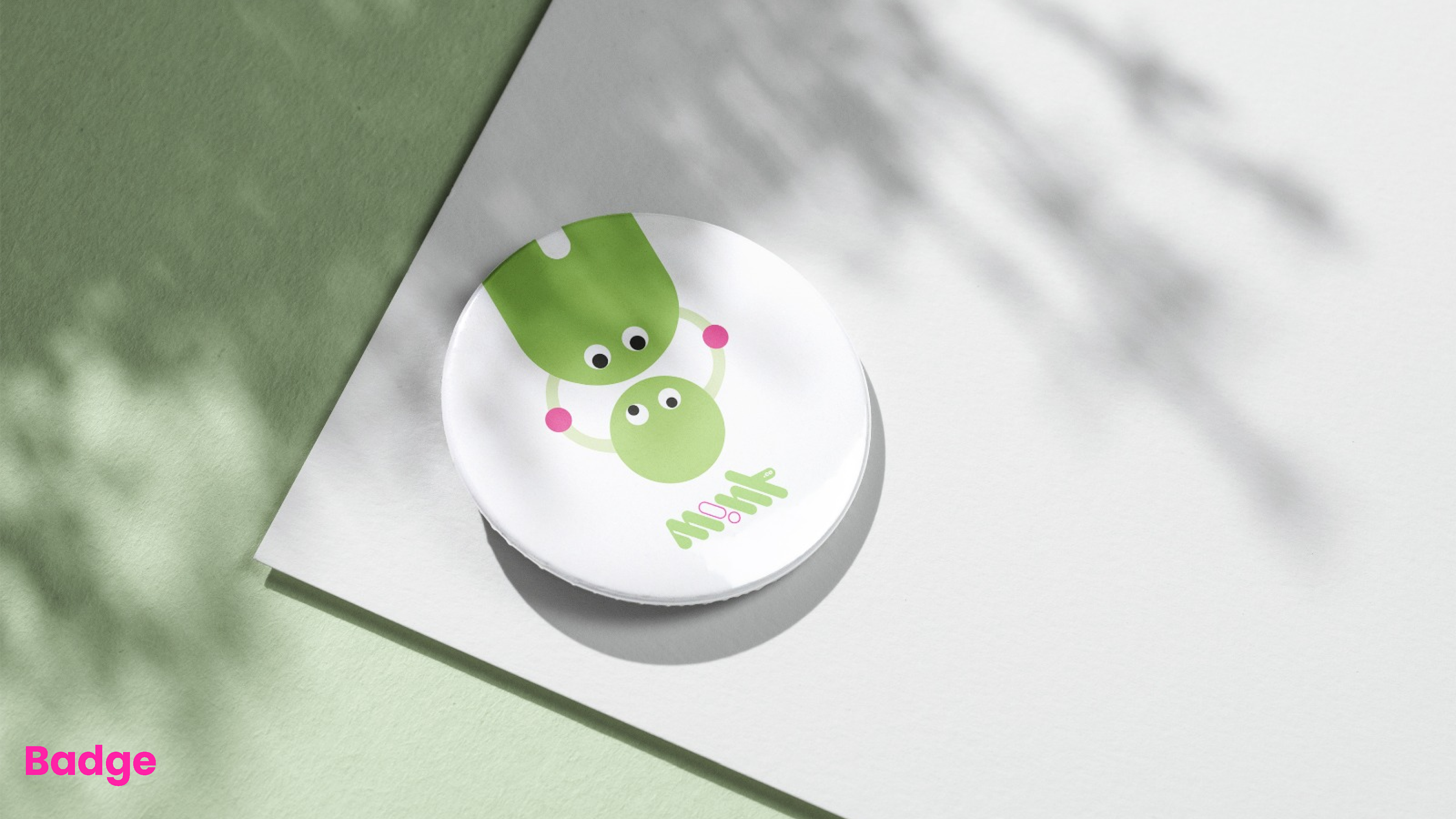
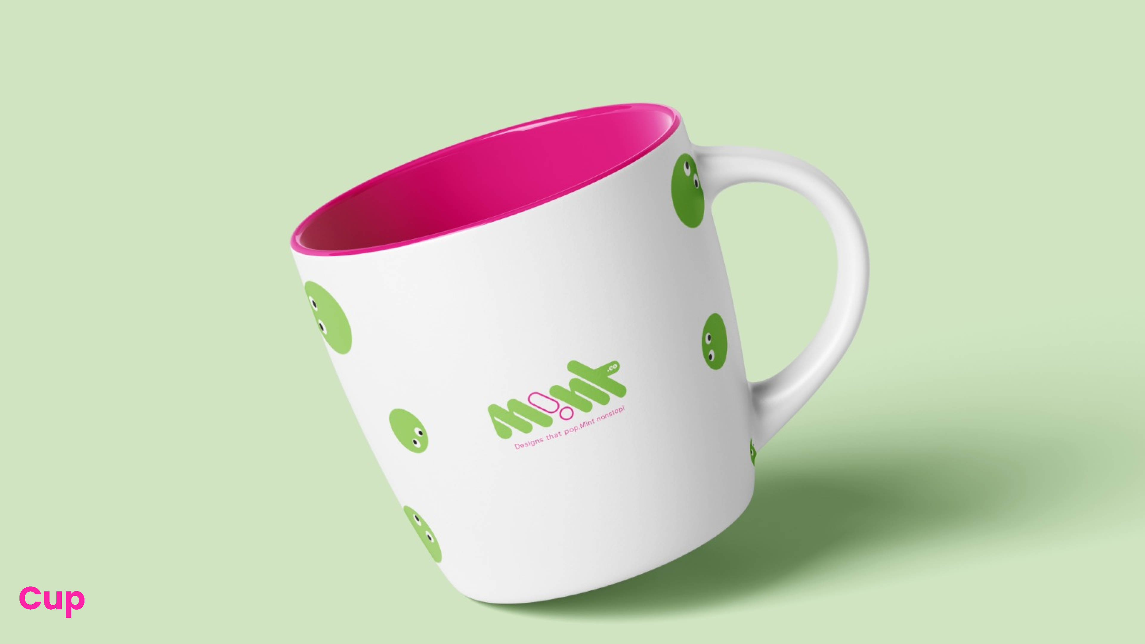
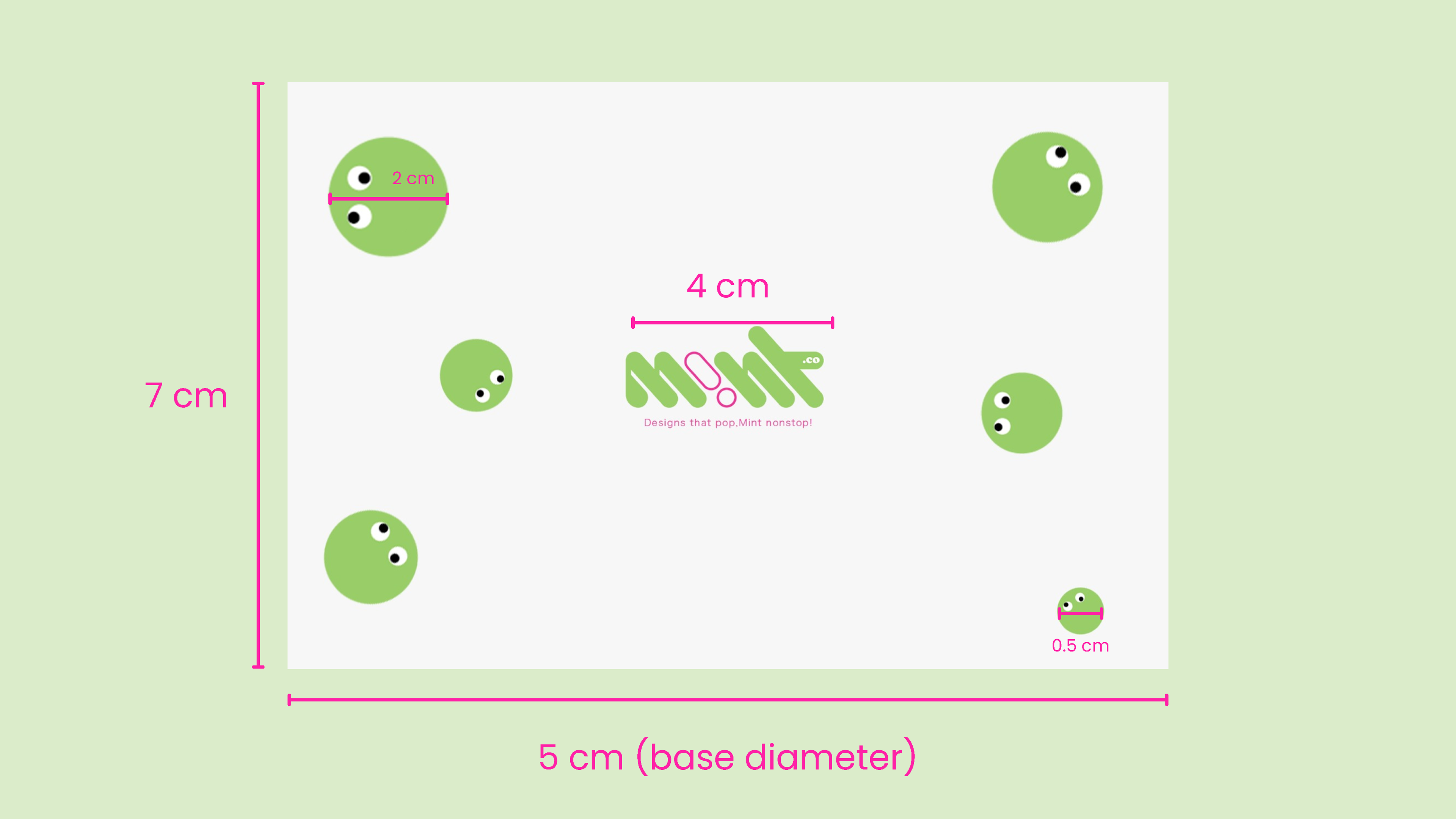
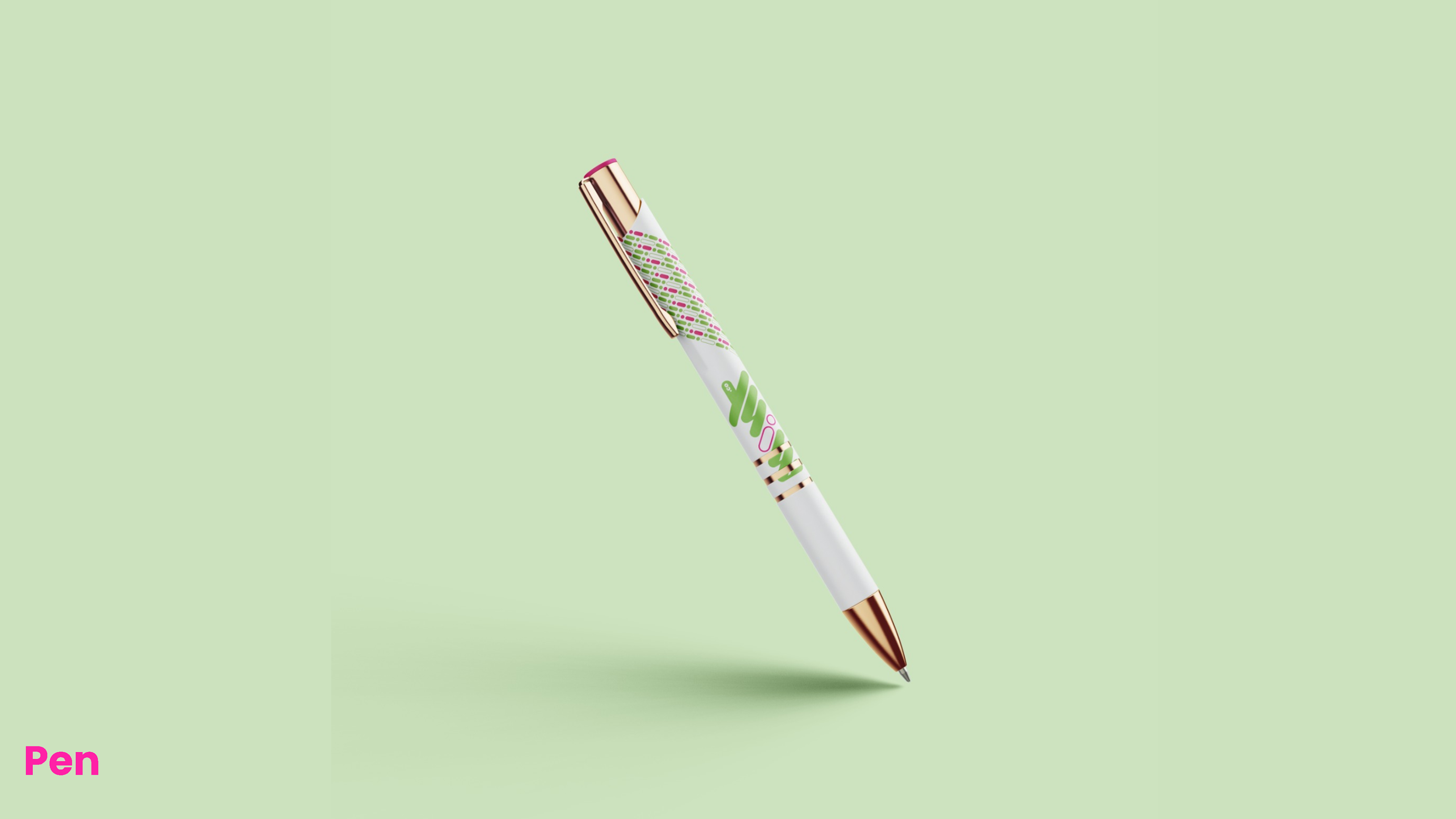
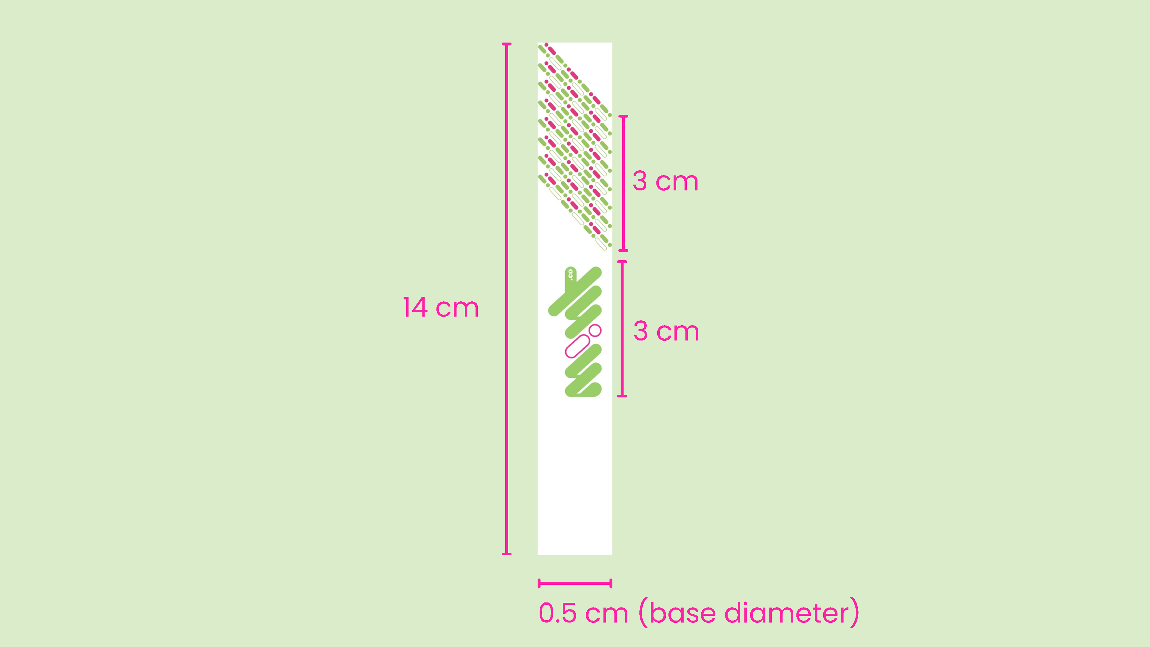
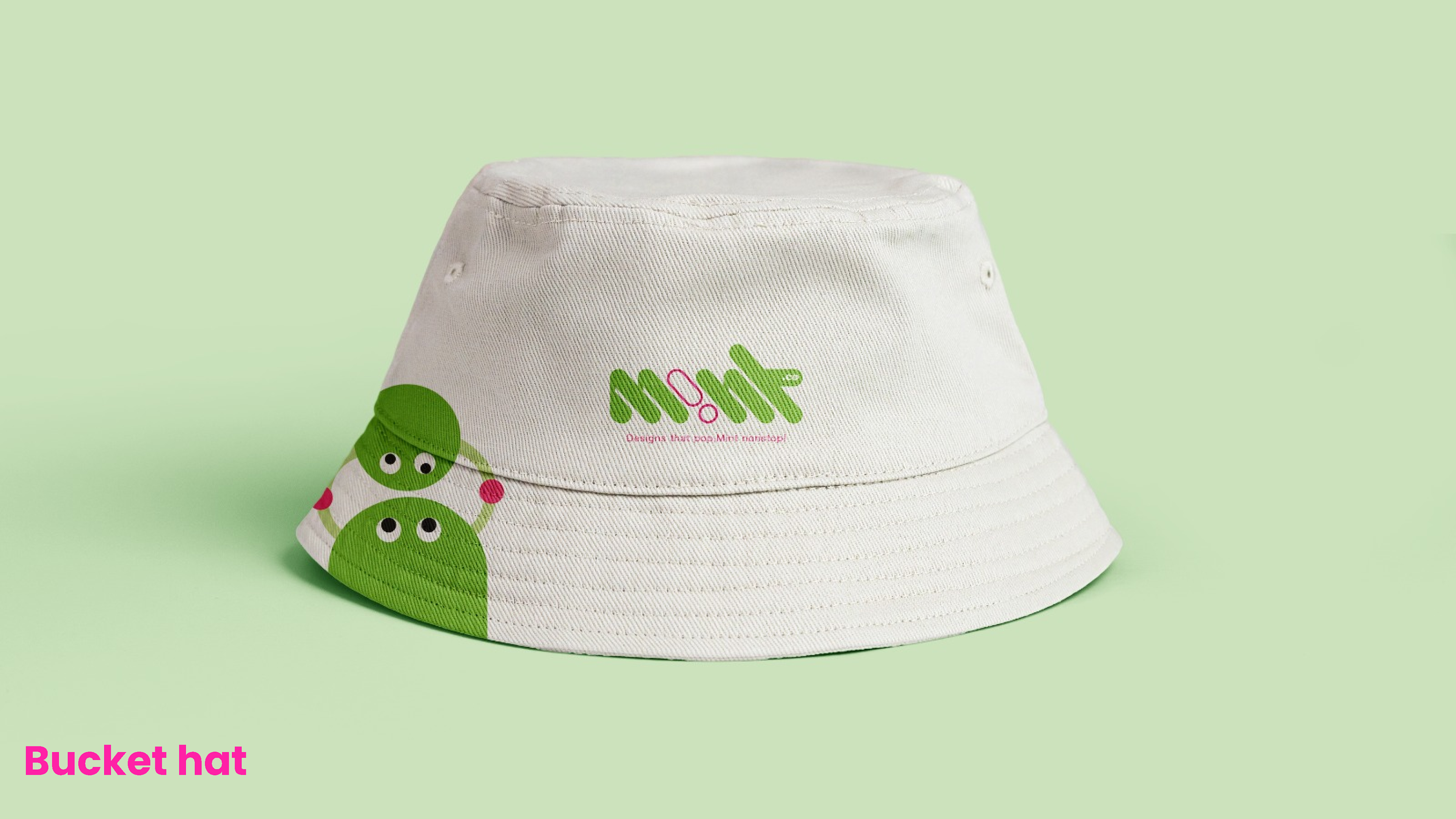
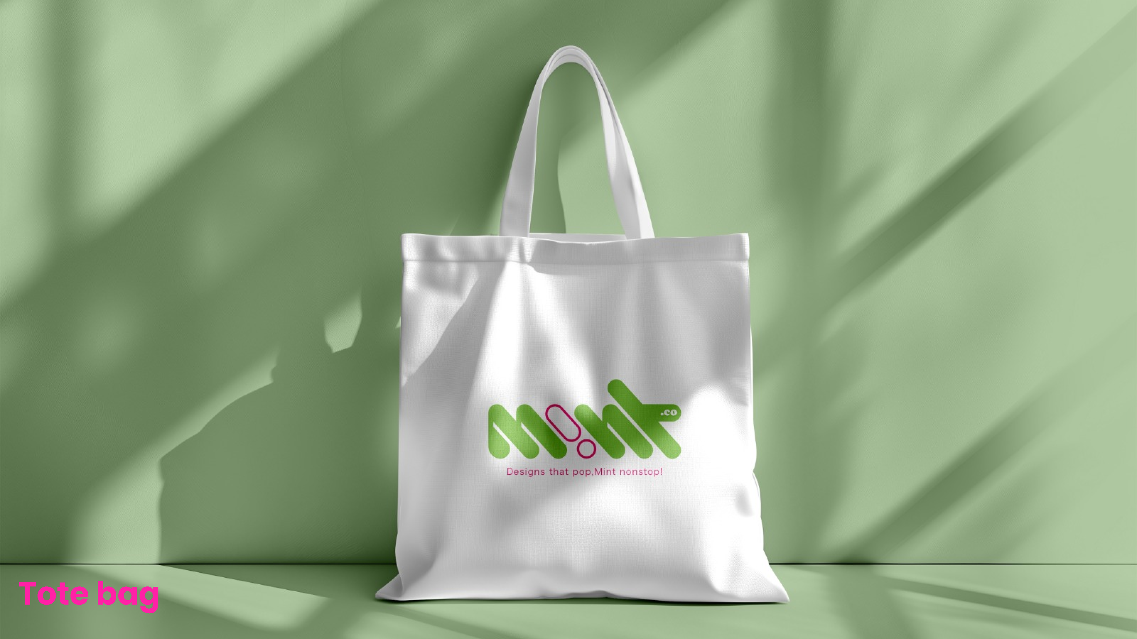
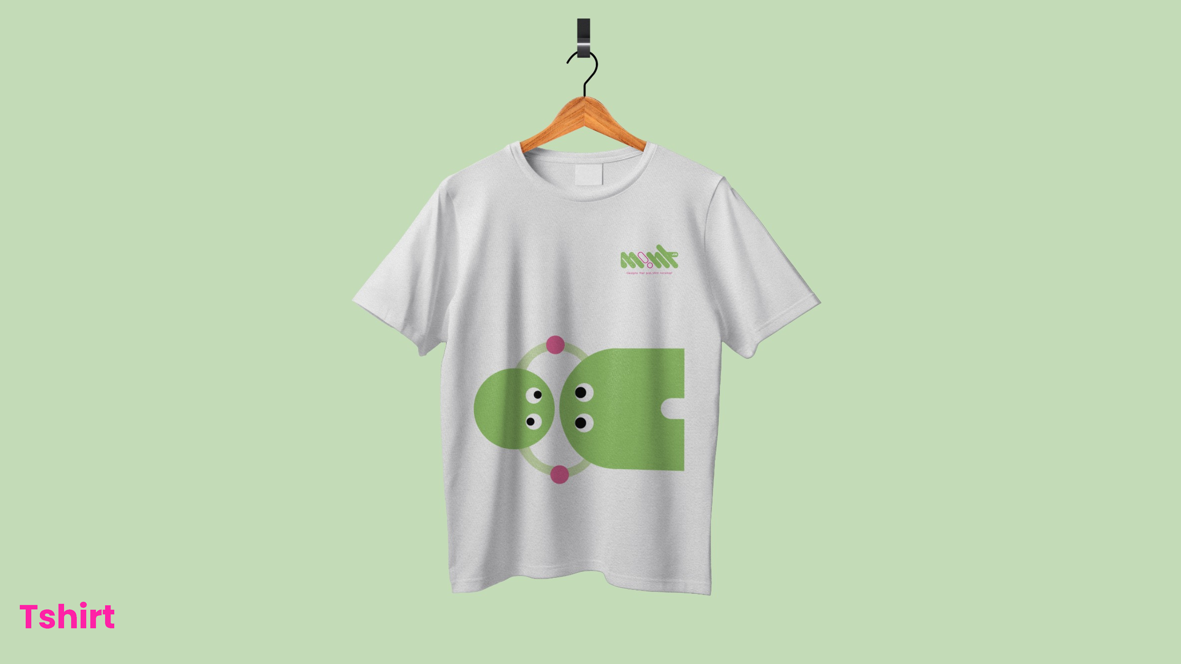
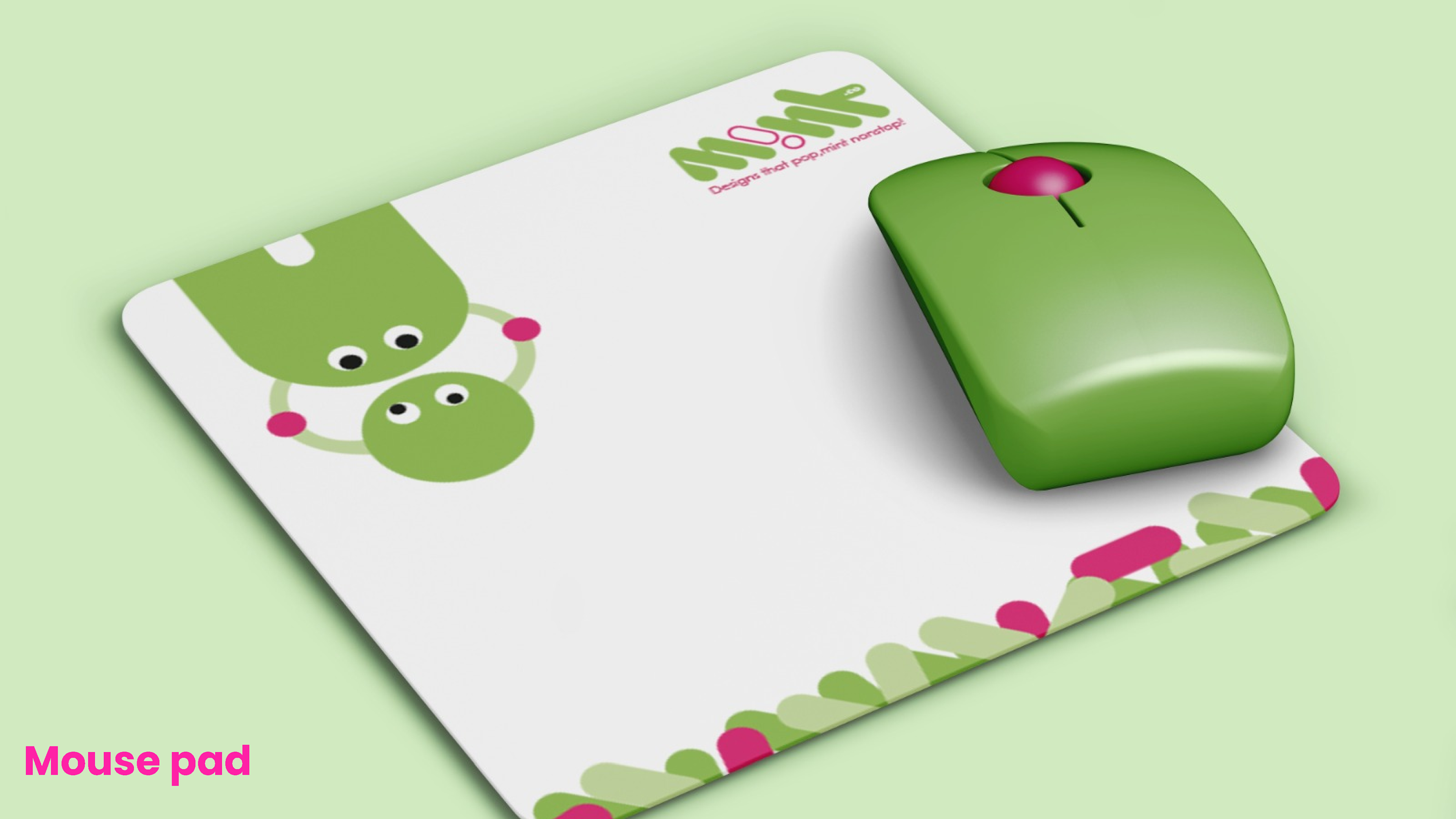
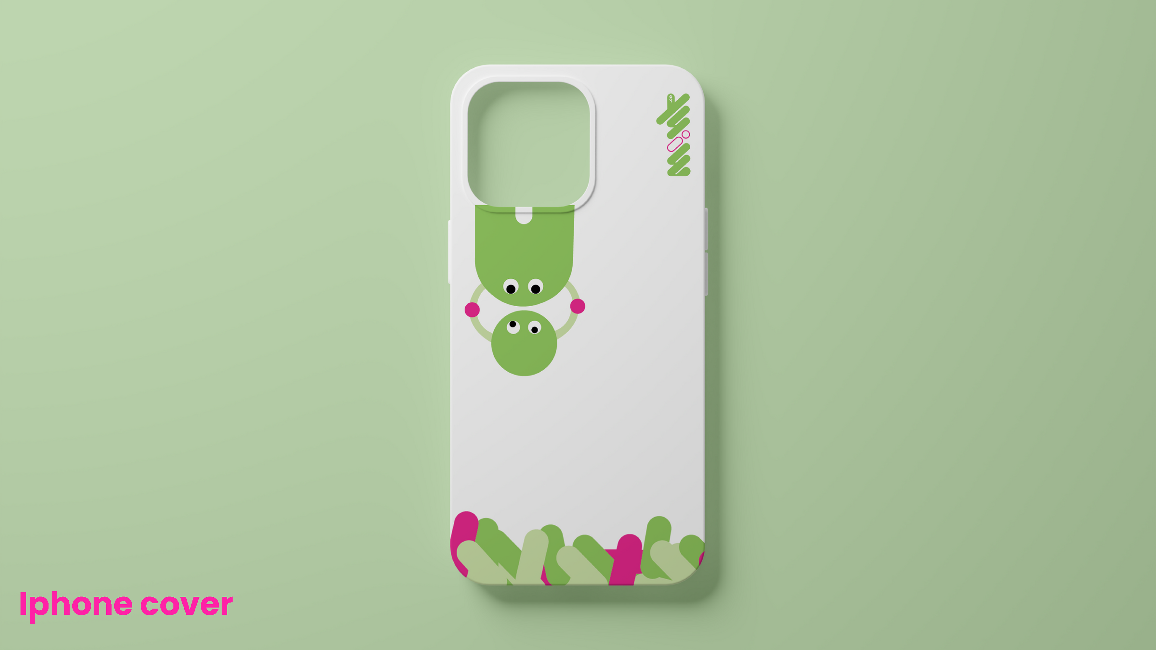
Merchandising
For the branded merchandise, focus was given on creating designs that were both fashionable and functional, ensuring they would be popular and wearable while maintaining the integrity of the brand identity.

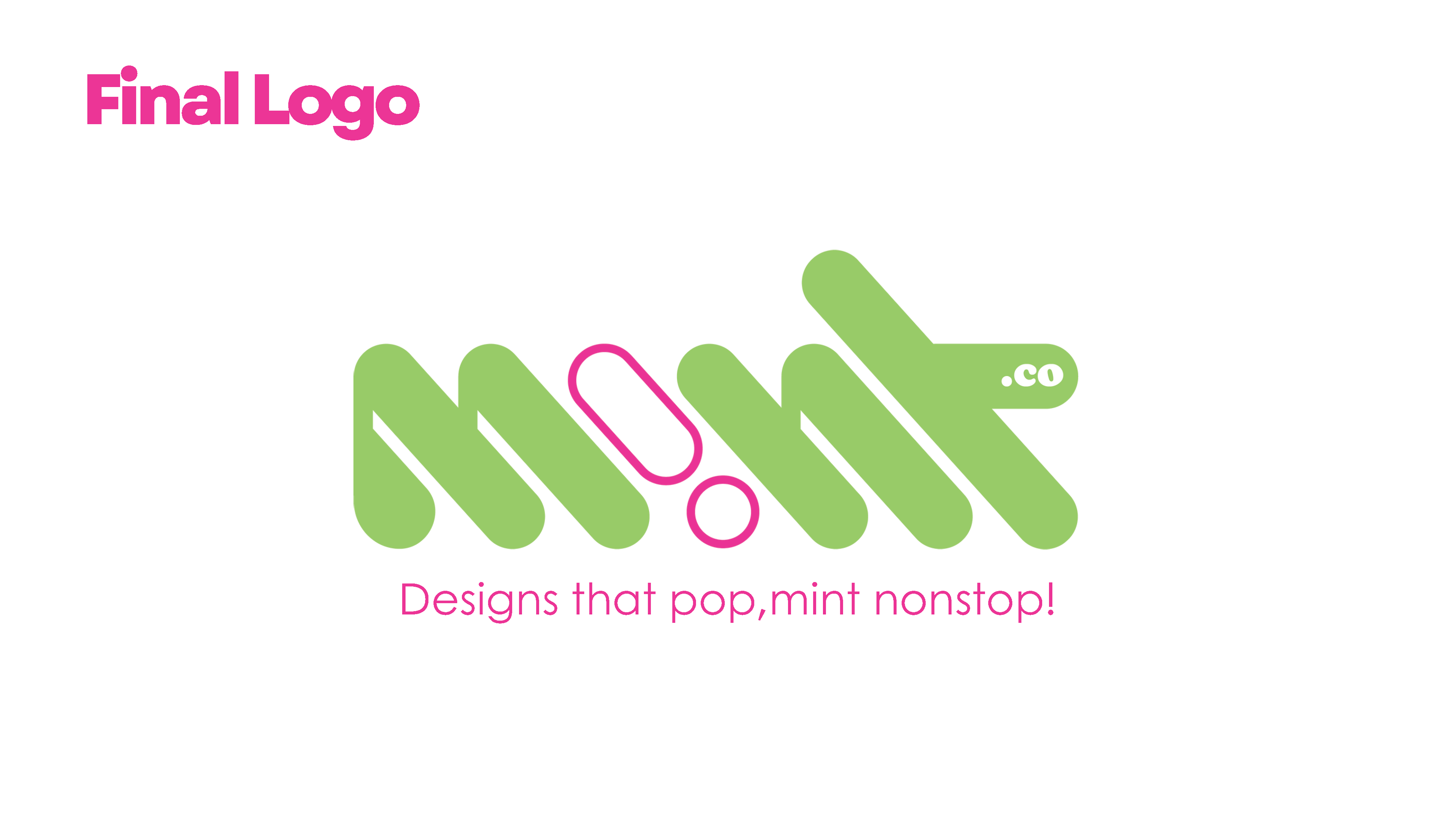
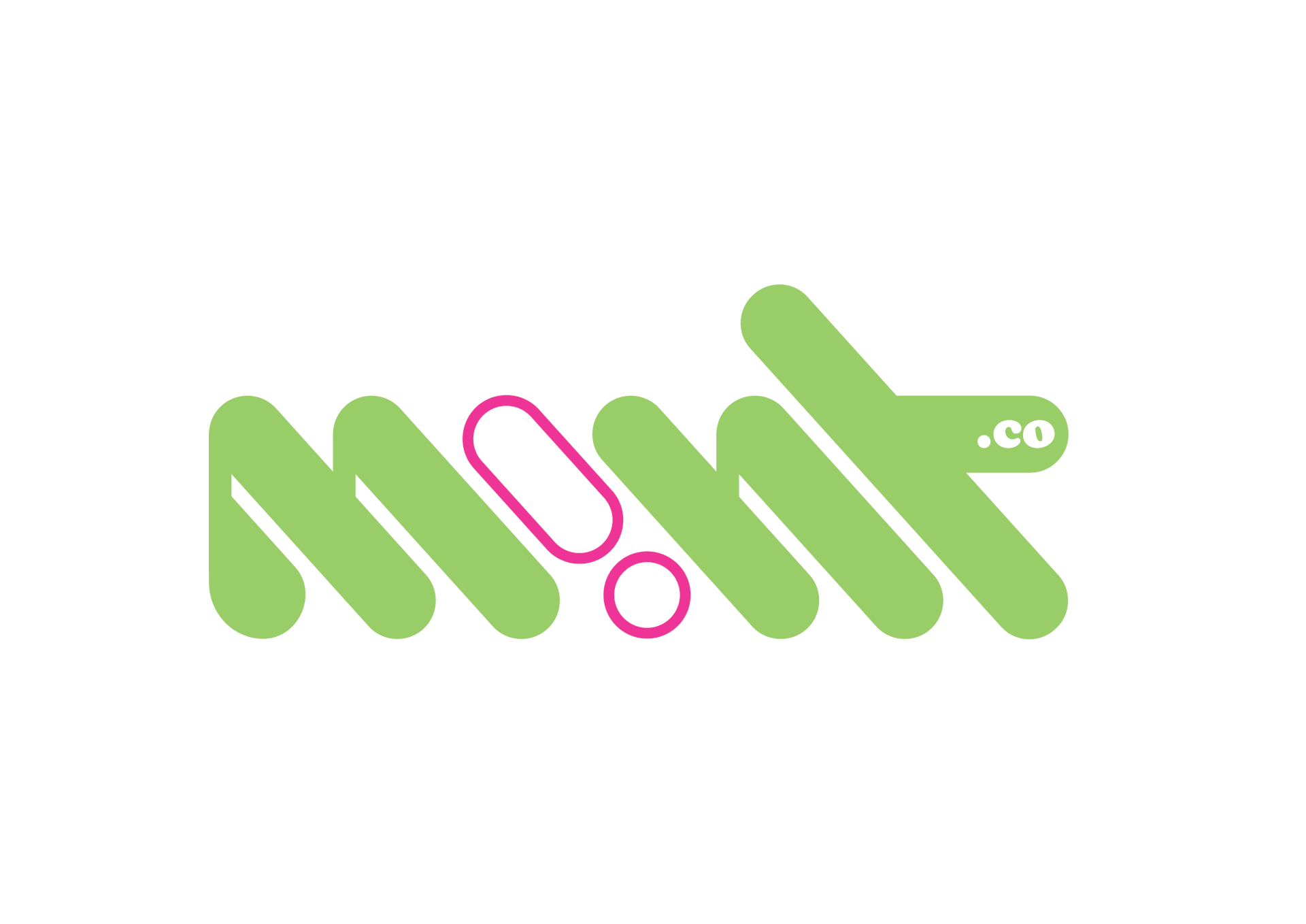
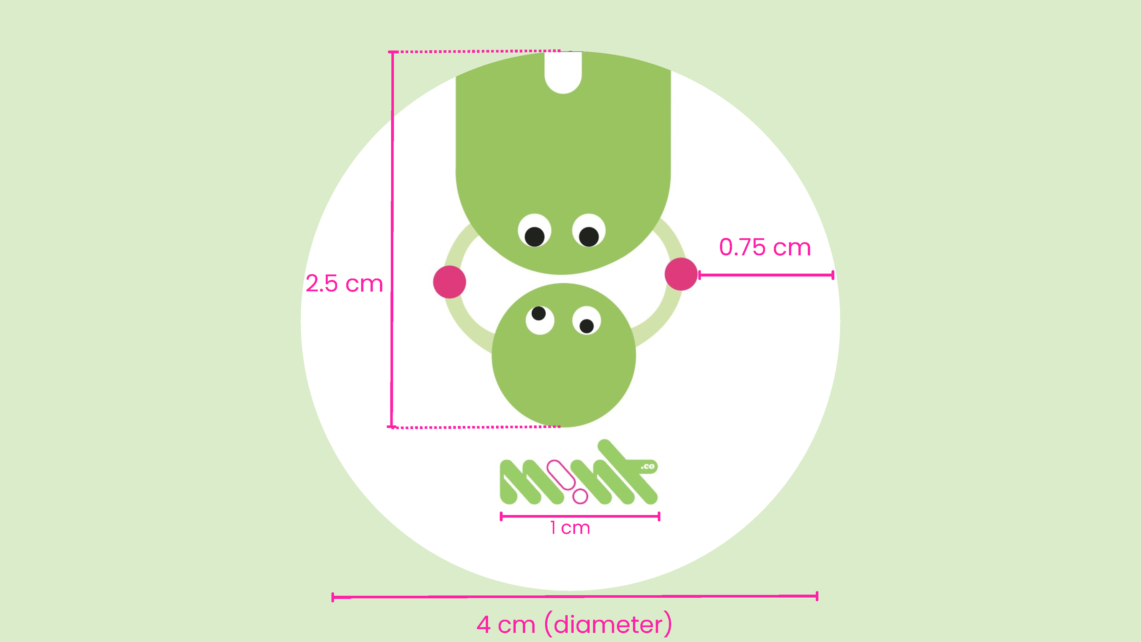
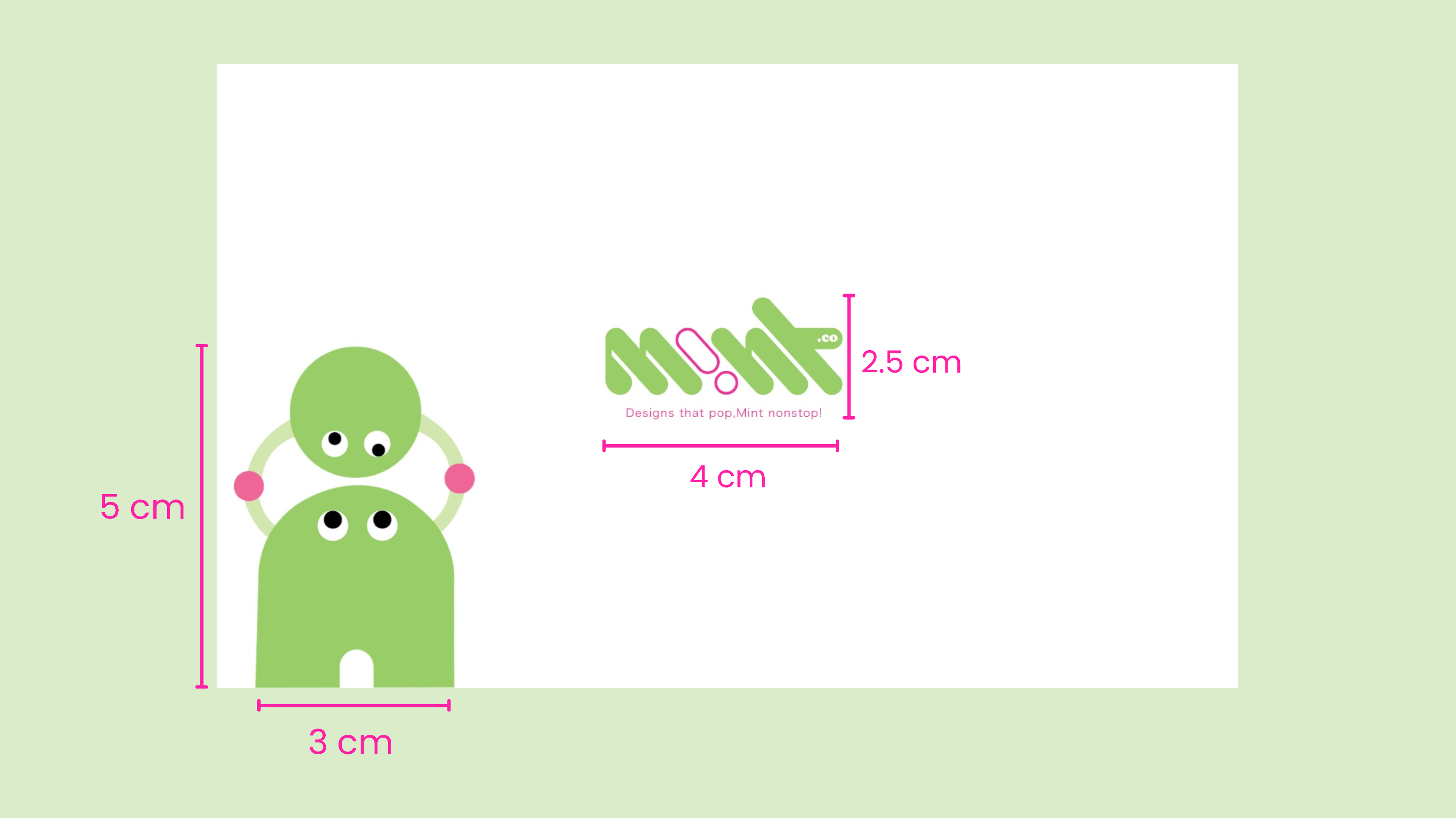
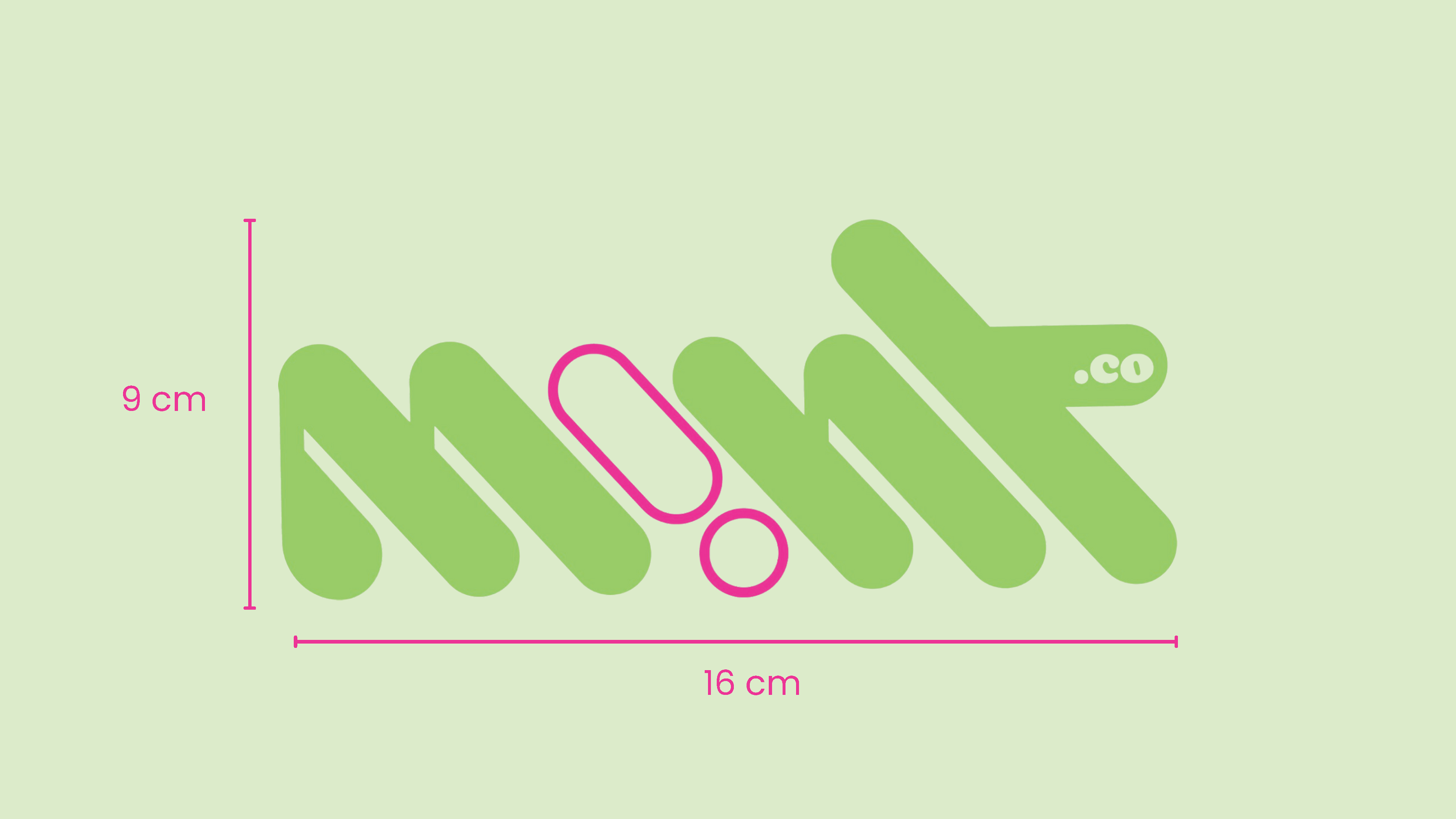
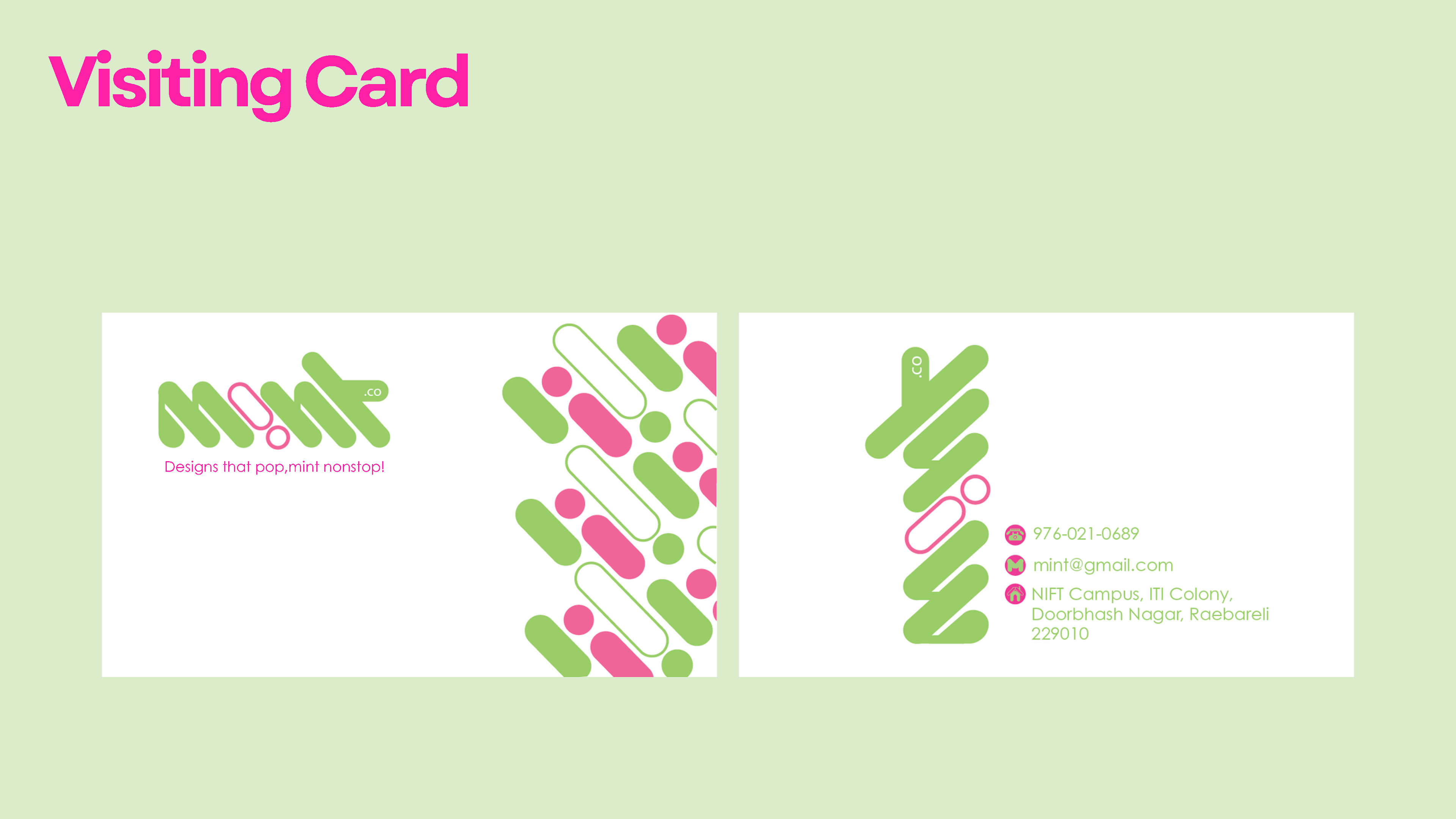
About the logo
The logo for "M!nt" uses a modern, rounded font with a fresh light green color, symbolizing freshness and creativity, which is ideal for a branding company. The playful pink exclamation mark in place of the "i" adds energy and draws attention, making the design stand out. The minimalistic approach with mirrored letters and the inclusion of ".co" suggests a digital-savvy, approachable brand focused on delivering fresh and impactful branding solutions.
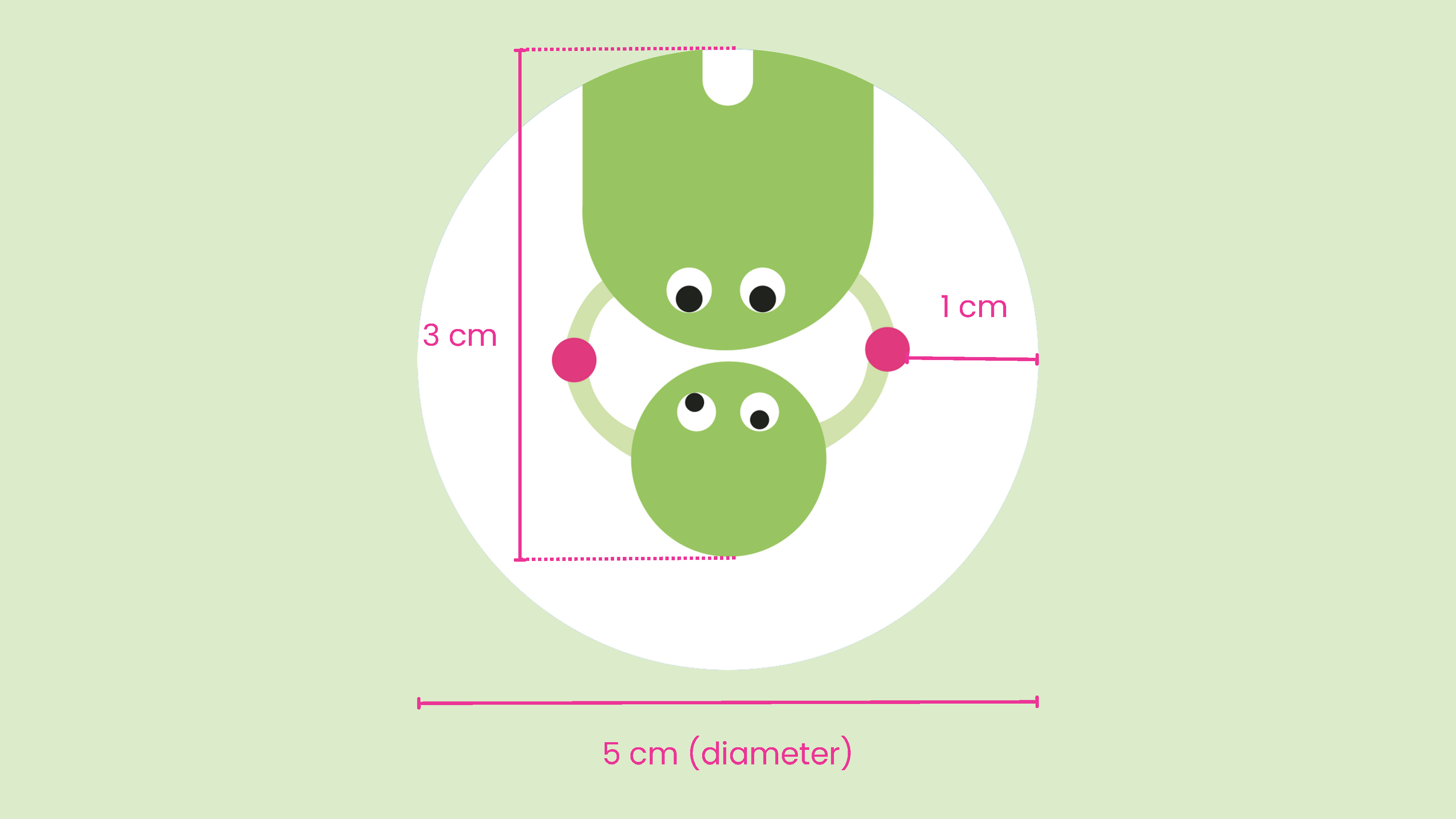
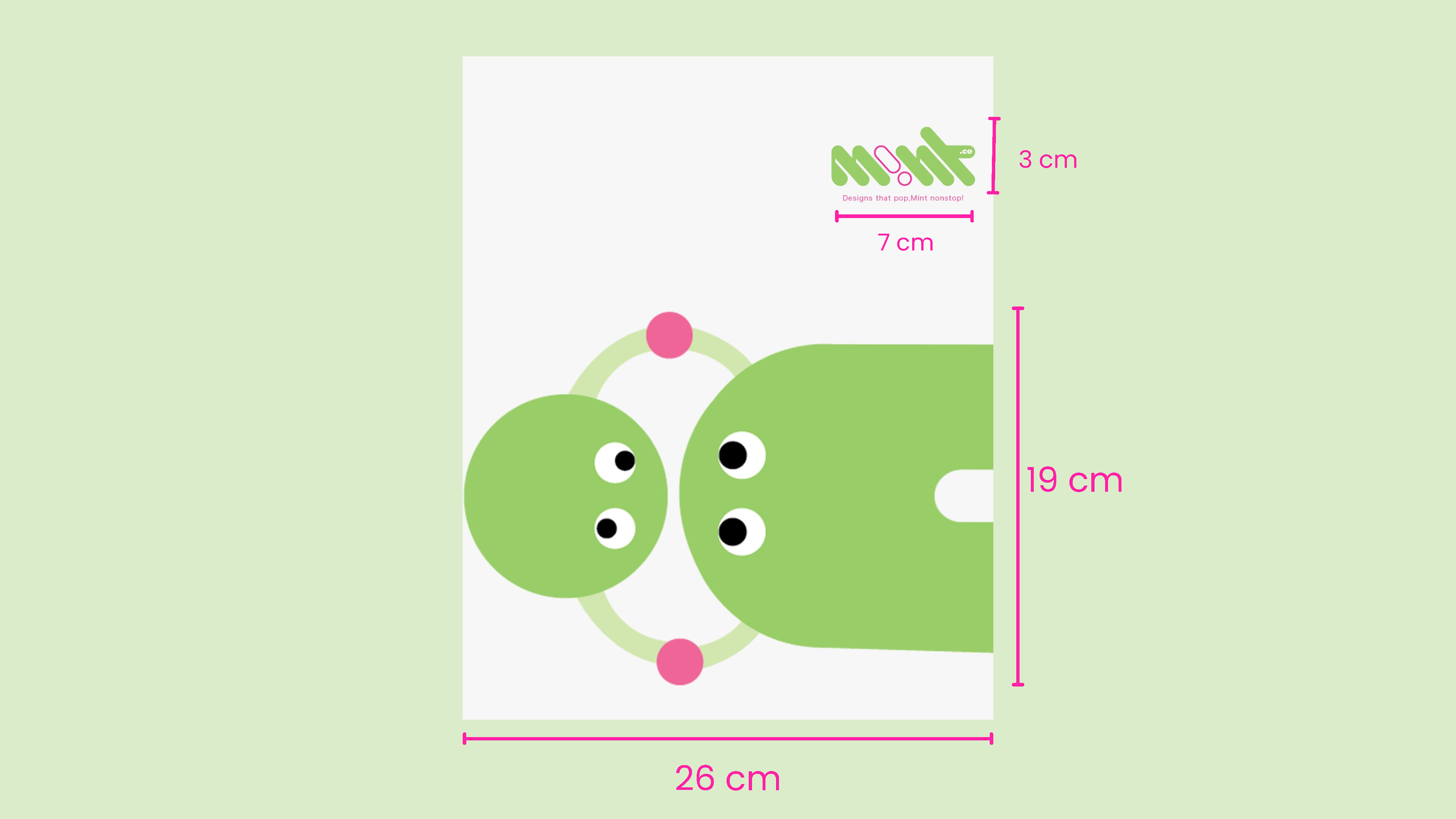
About the Element
The mascot derived from the letter 'i', where the 'i' is holding its dot. This element reflects how Mint guides its clients through the complex journey of brand development, hand-in-hand, ensuring their vision and values are represented authentically. The playful yet meaningful gesture in the logo encapsulates Mint's commitment to delivering personalized, innovative branding solutions that resonate deeply with each client's unique identity.
Challenges Faced
One of the challenges was maintaining a balance between creativity and professionalism, especially when designing for both corporate identity and branded merchandise. The solution was to create designs that felt modern and fresh but still polished and professional, which would resonate across a variety of platforms and materials.
Thanks for Viewing!